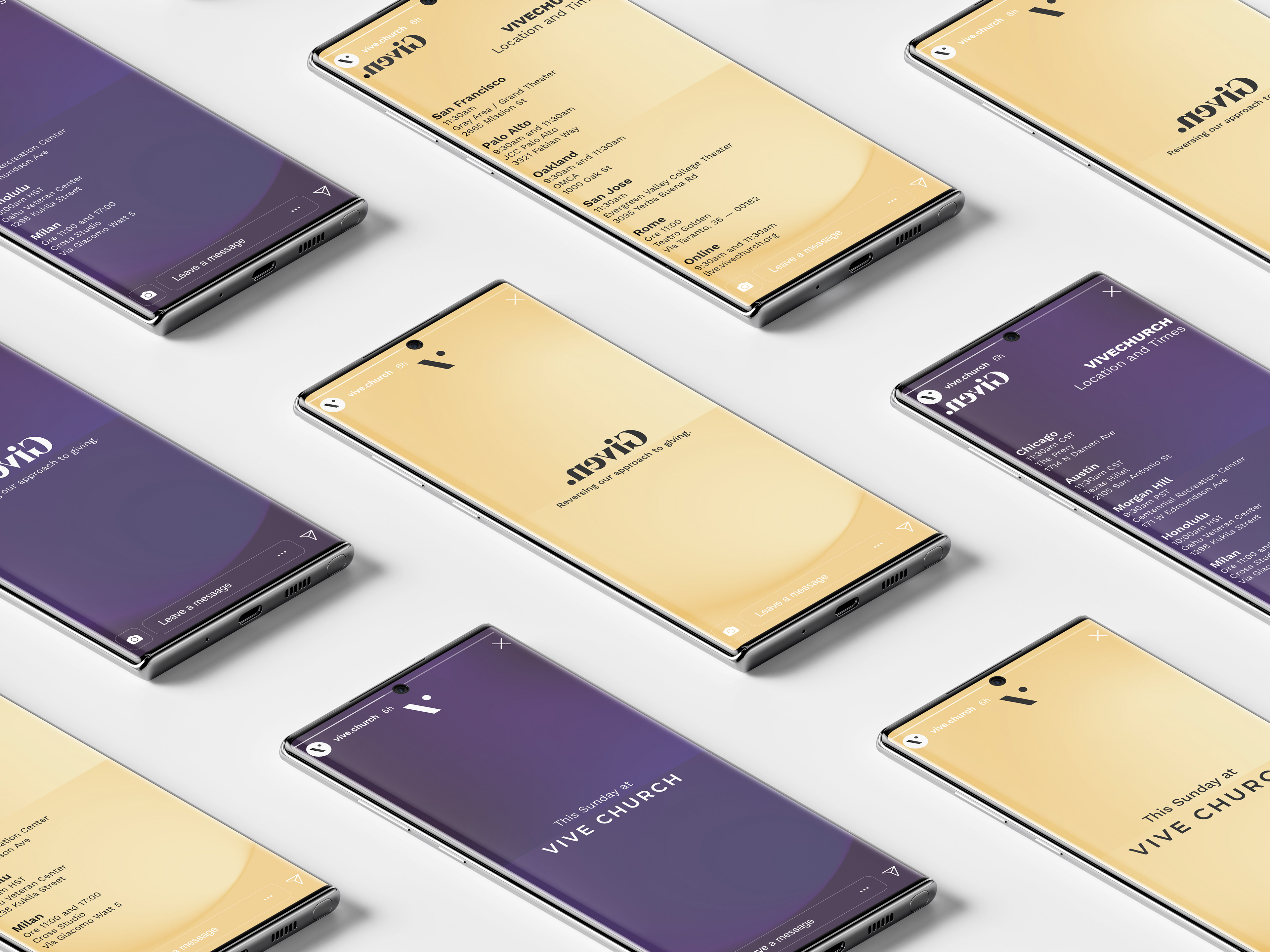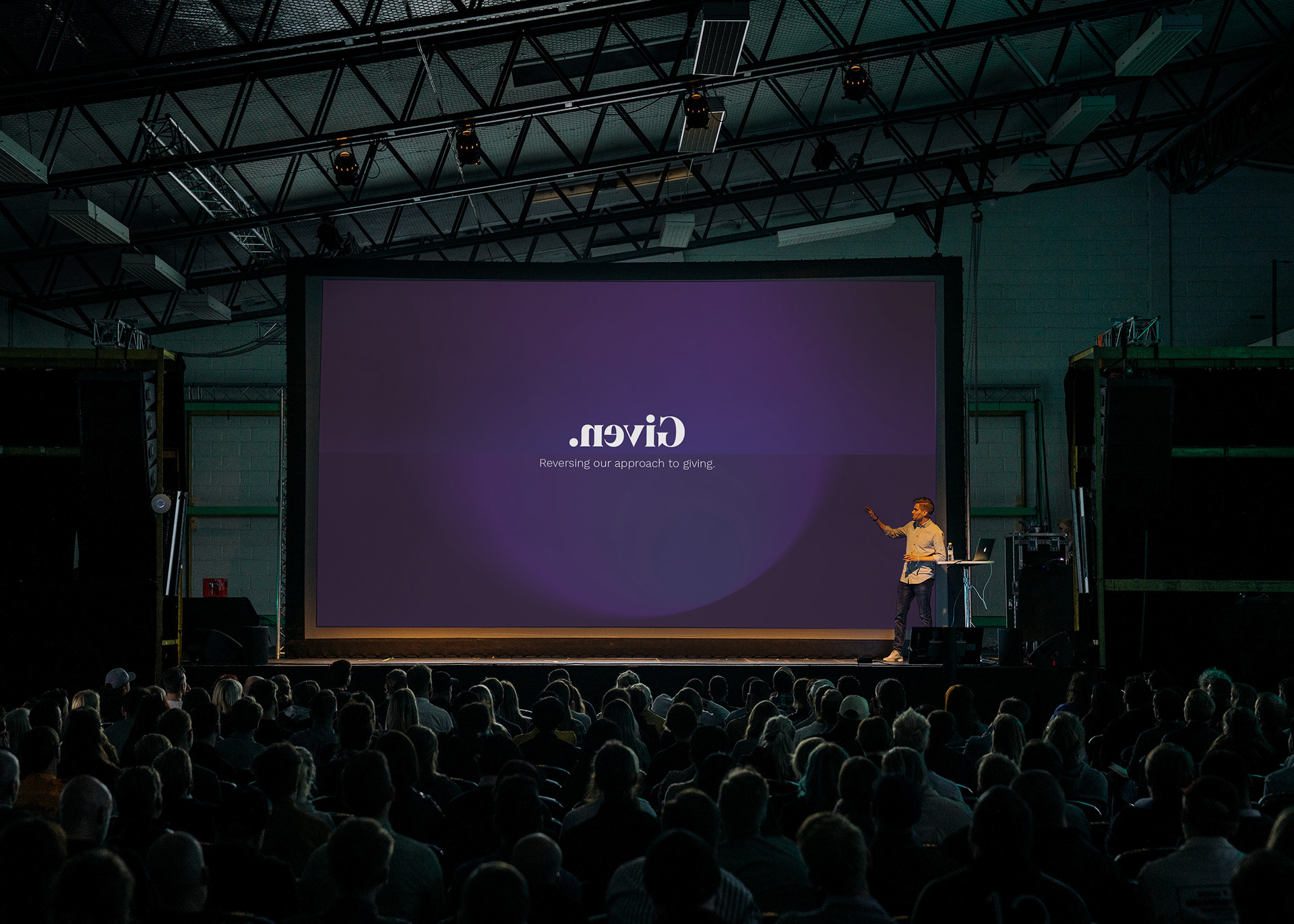
This work marked the beginning of an ongoing collaboration with ‘Vive Church’, an organization based in Palo Alto, California. They reached out asking to develop the brand identity for an upcoming series of meetings named “Given”, with the theme of ‘reversing the concept of offering’.
The client provided a couple of key themes in their initial brief, so I started exploring a number of color and shape combination, along with some iconography that would reinforce the message.
Key Themes
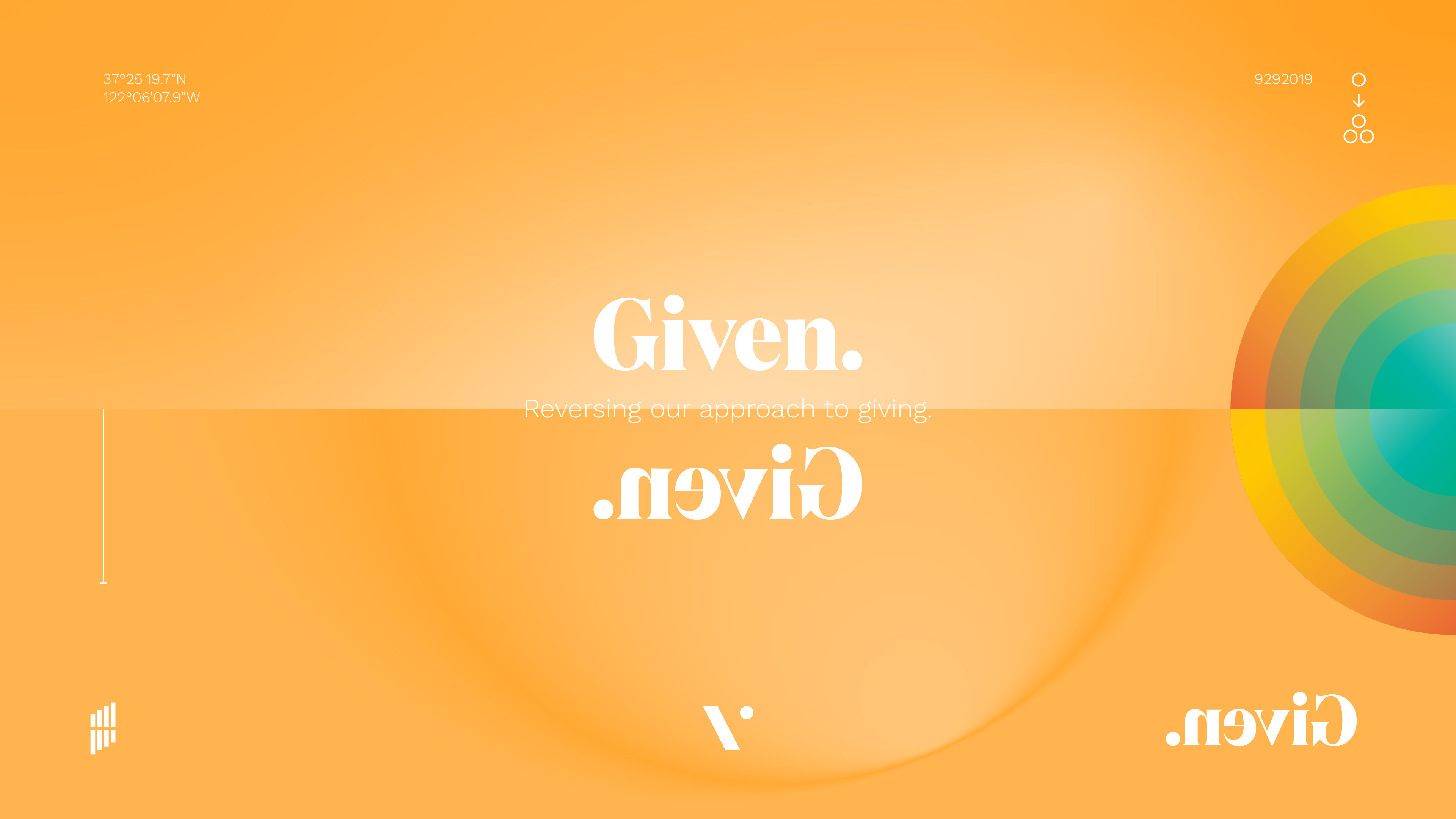
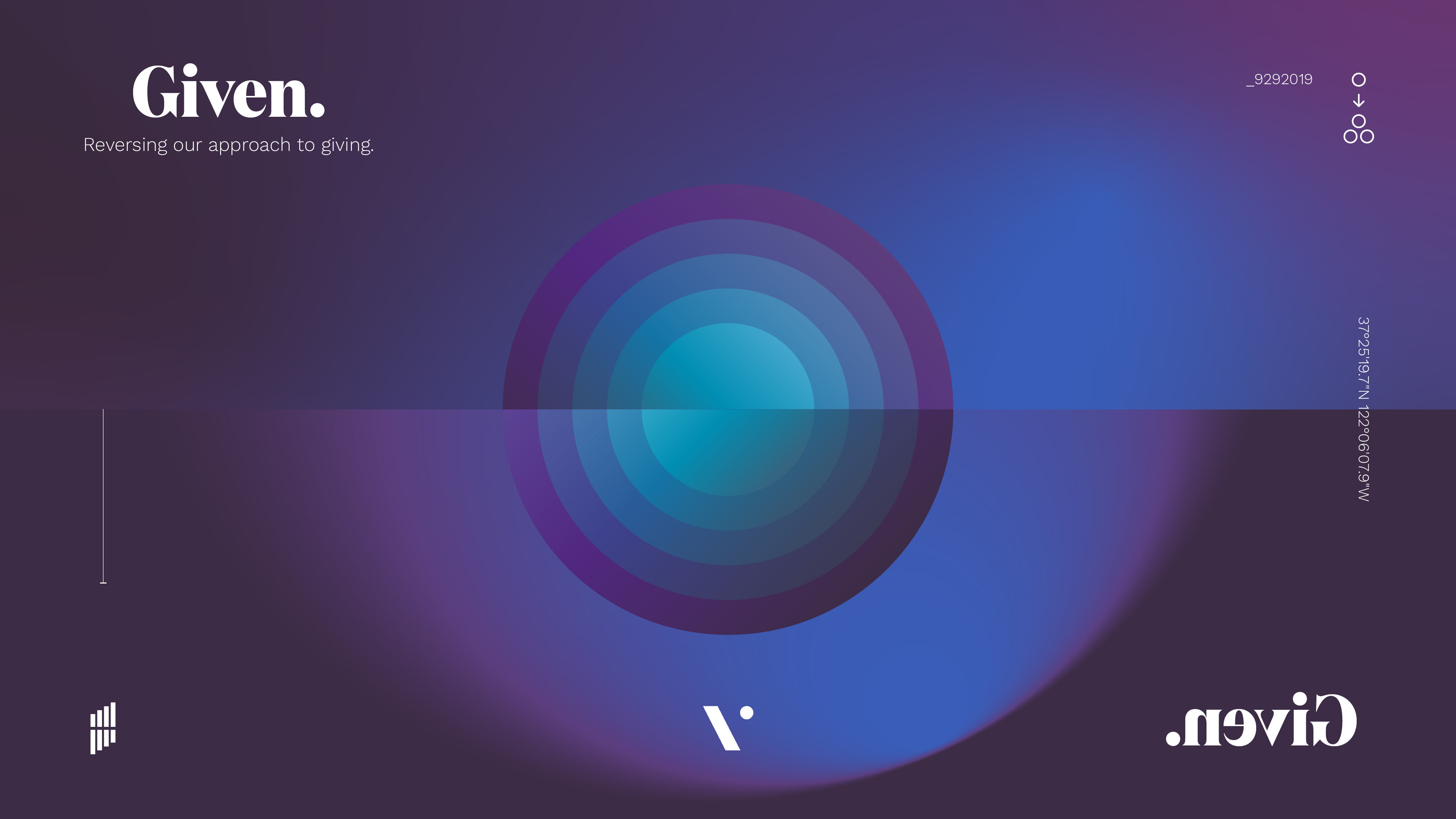
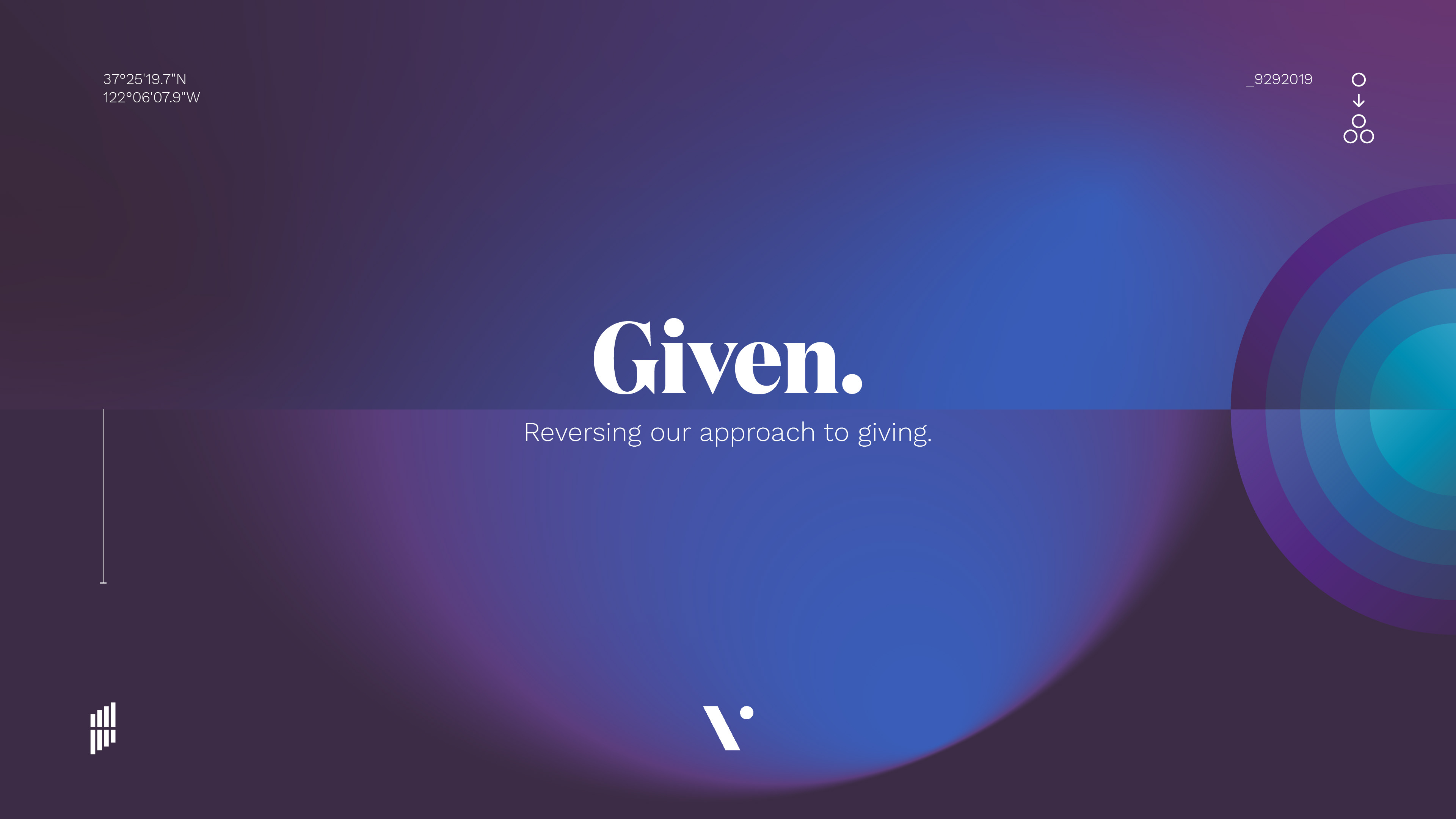
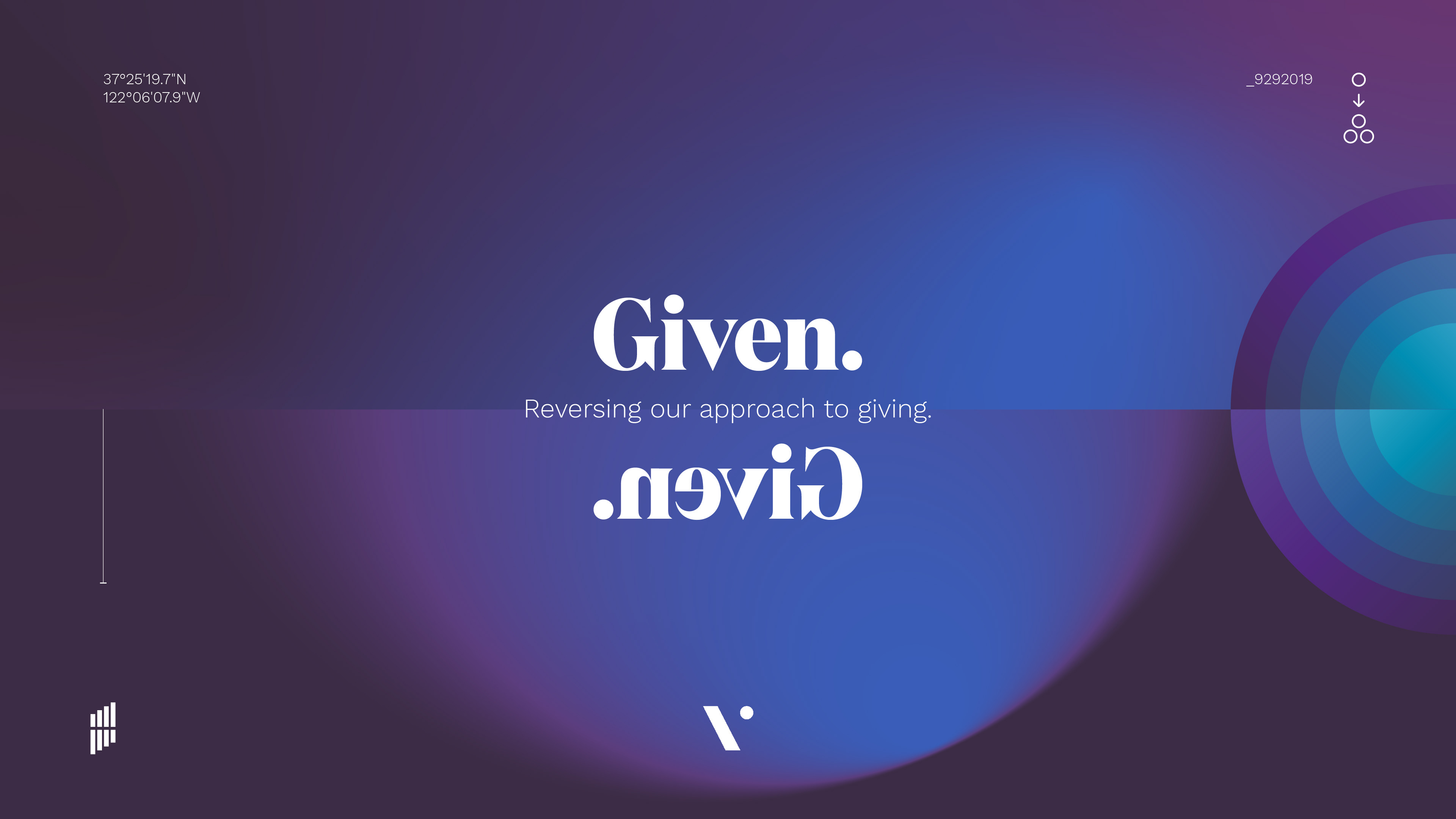
The given-give back:
we are gifted from God in the first place. Called to steward, grow and give back to others. Two faces of the same coin.
we are gifted from God in the first place. Called to steward, grow and give back to others. Two faces of the same coin.
The ripple effect:
the water drop that is released in a mass of water. Contributing to the bigger picture, creating a ripple effect much bigger then the drop itself.
the water drop that is released in a mass of water. Contributing to the bigger picture, creating a ripple effect much bigger then the drop itself.
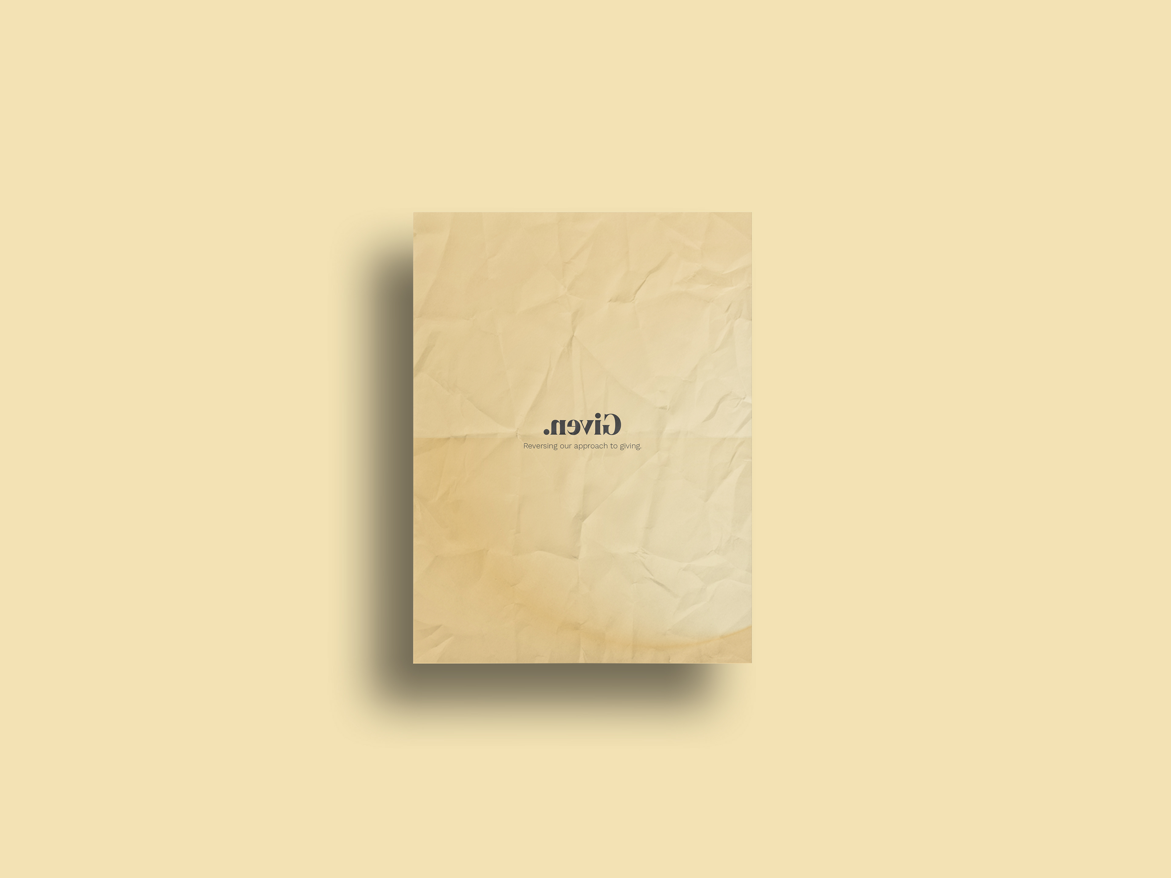
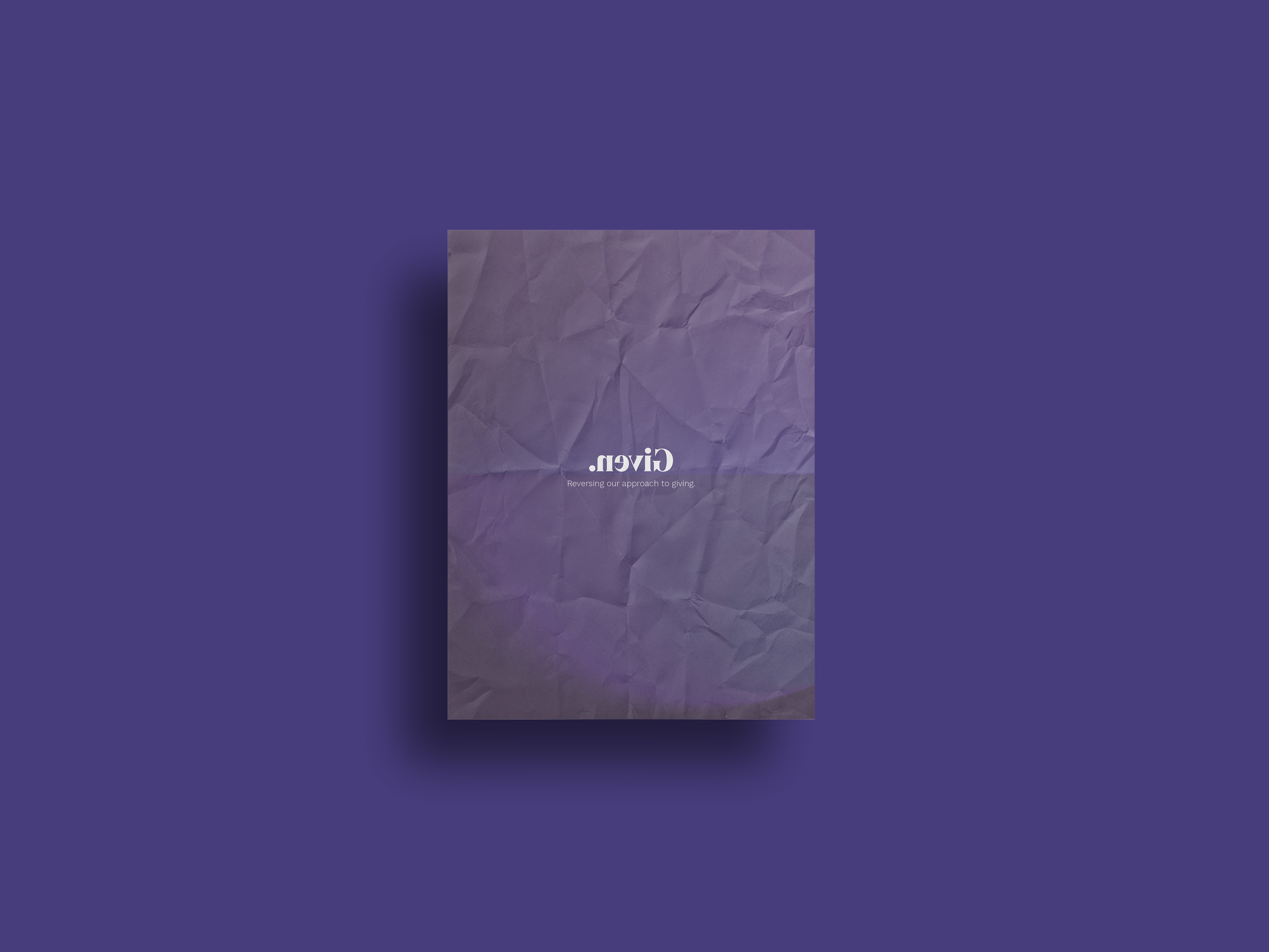
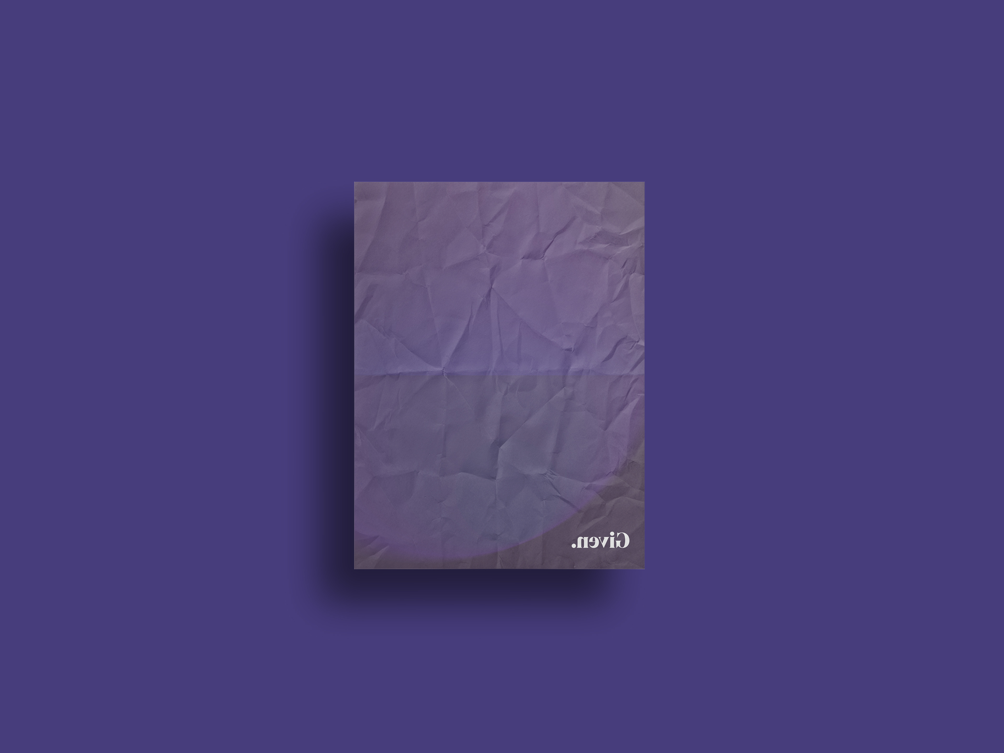
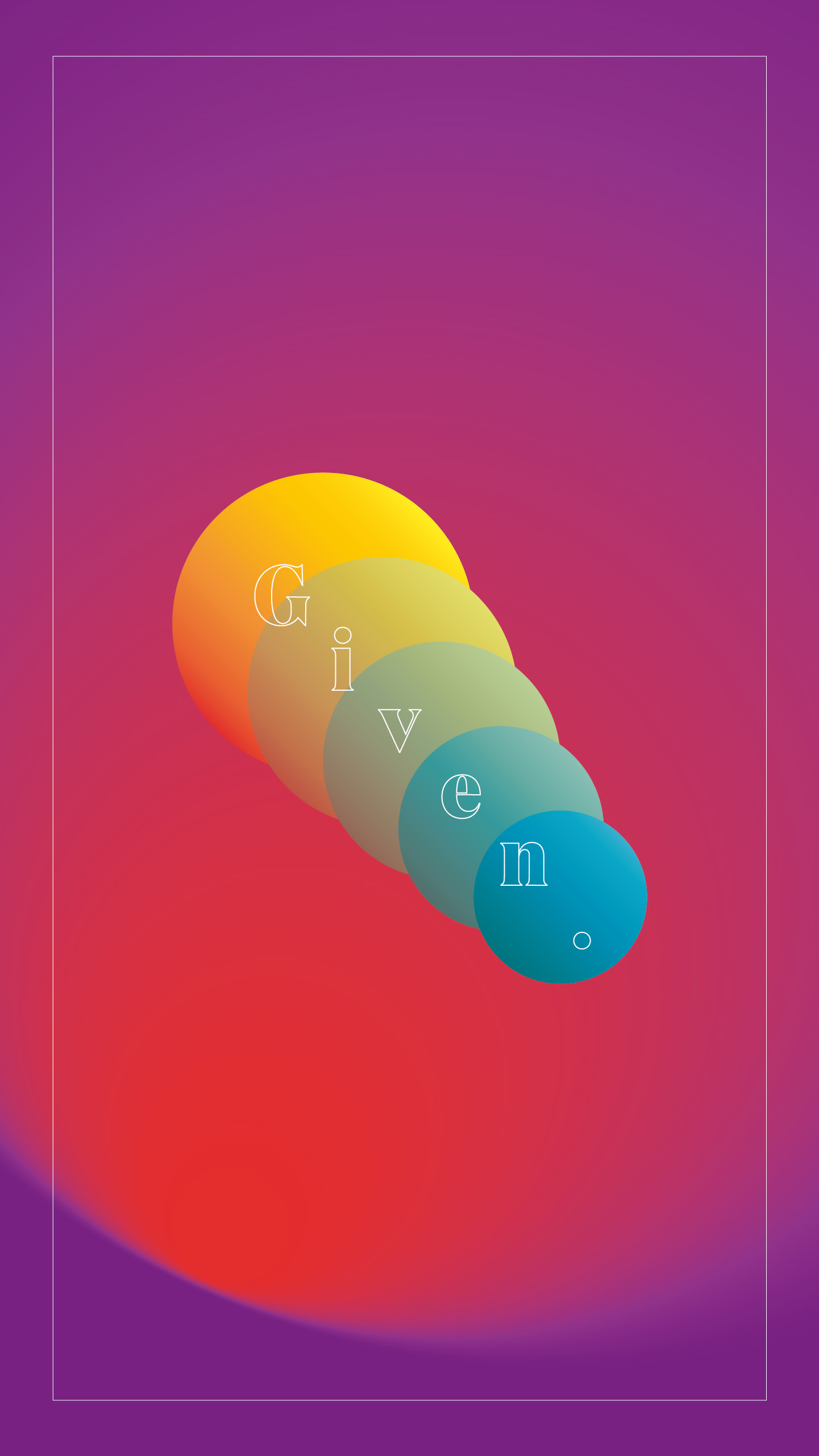
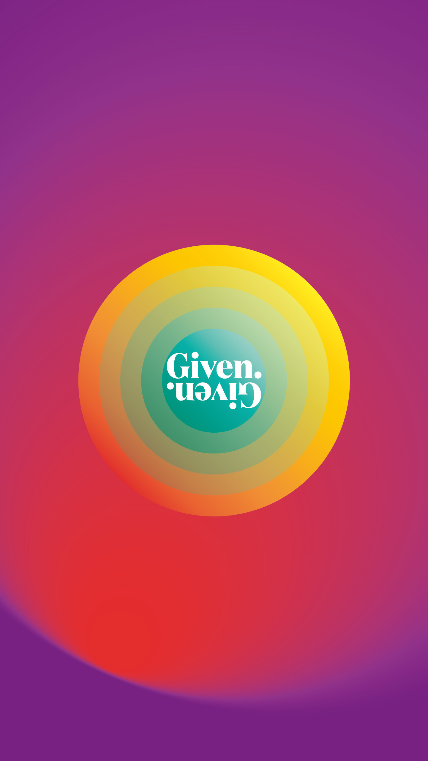
Early Study
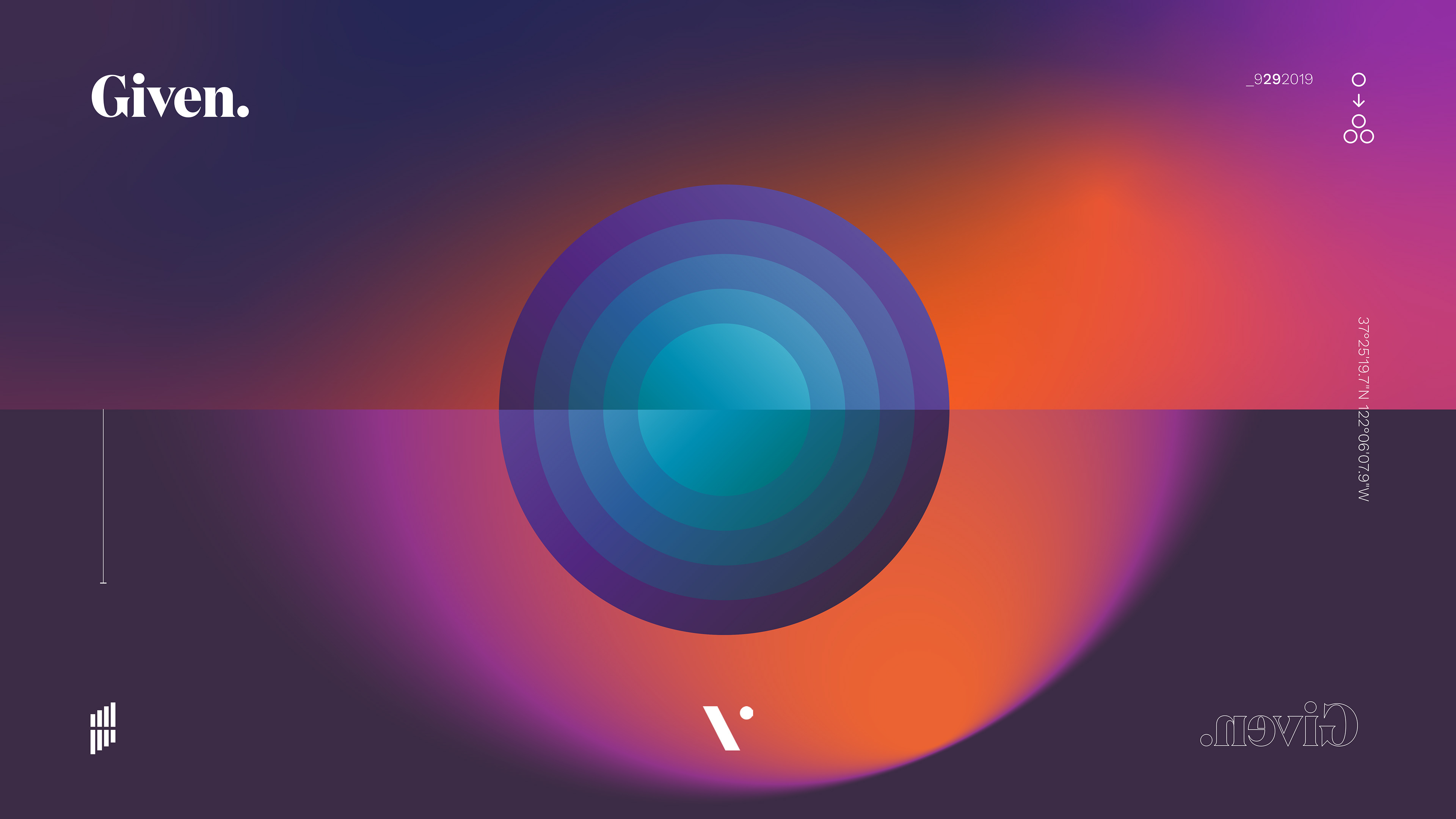
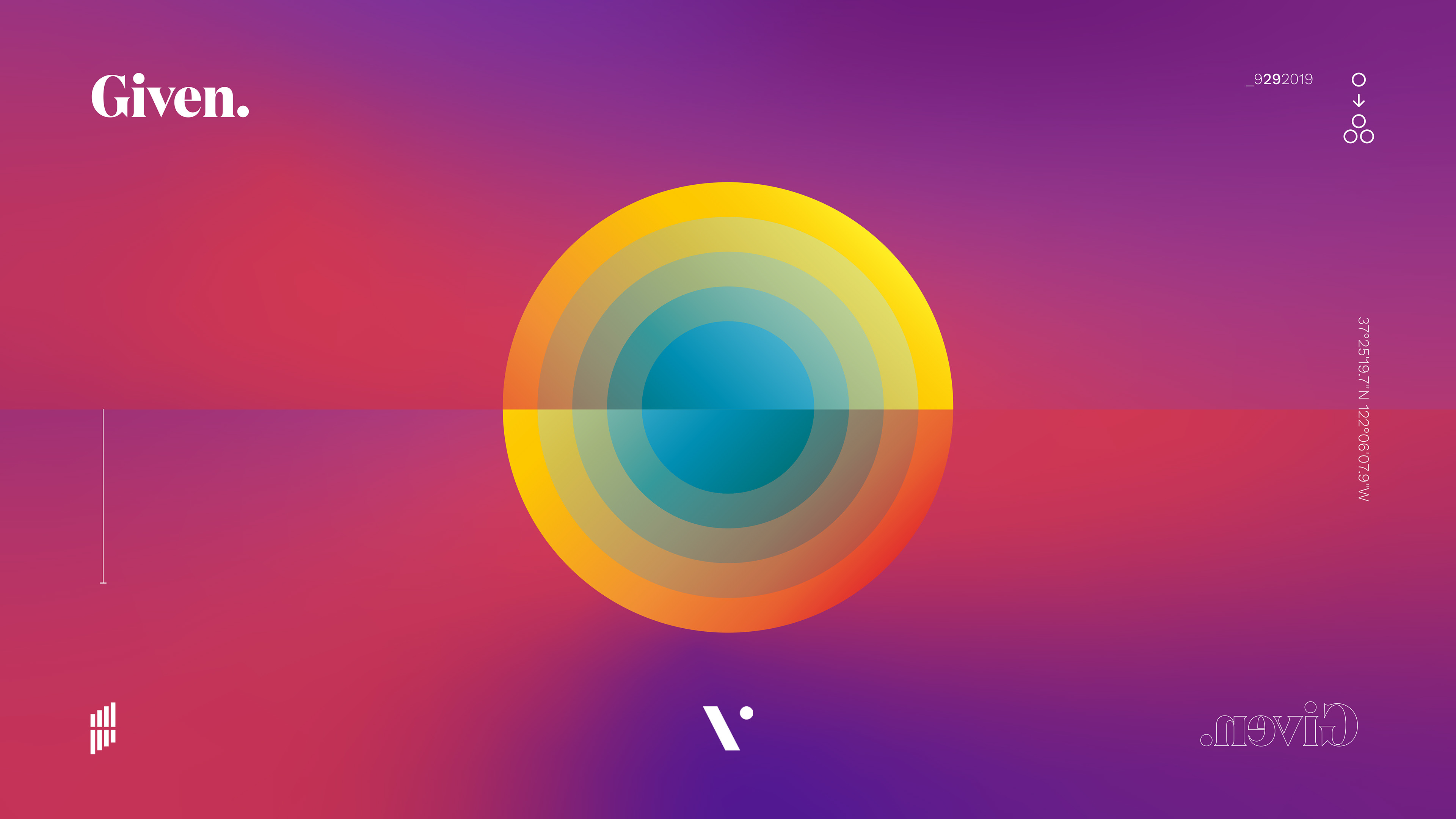
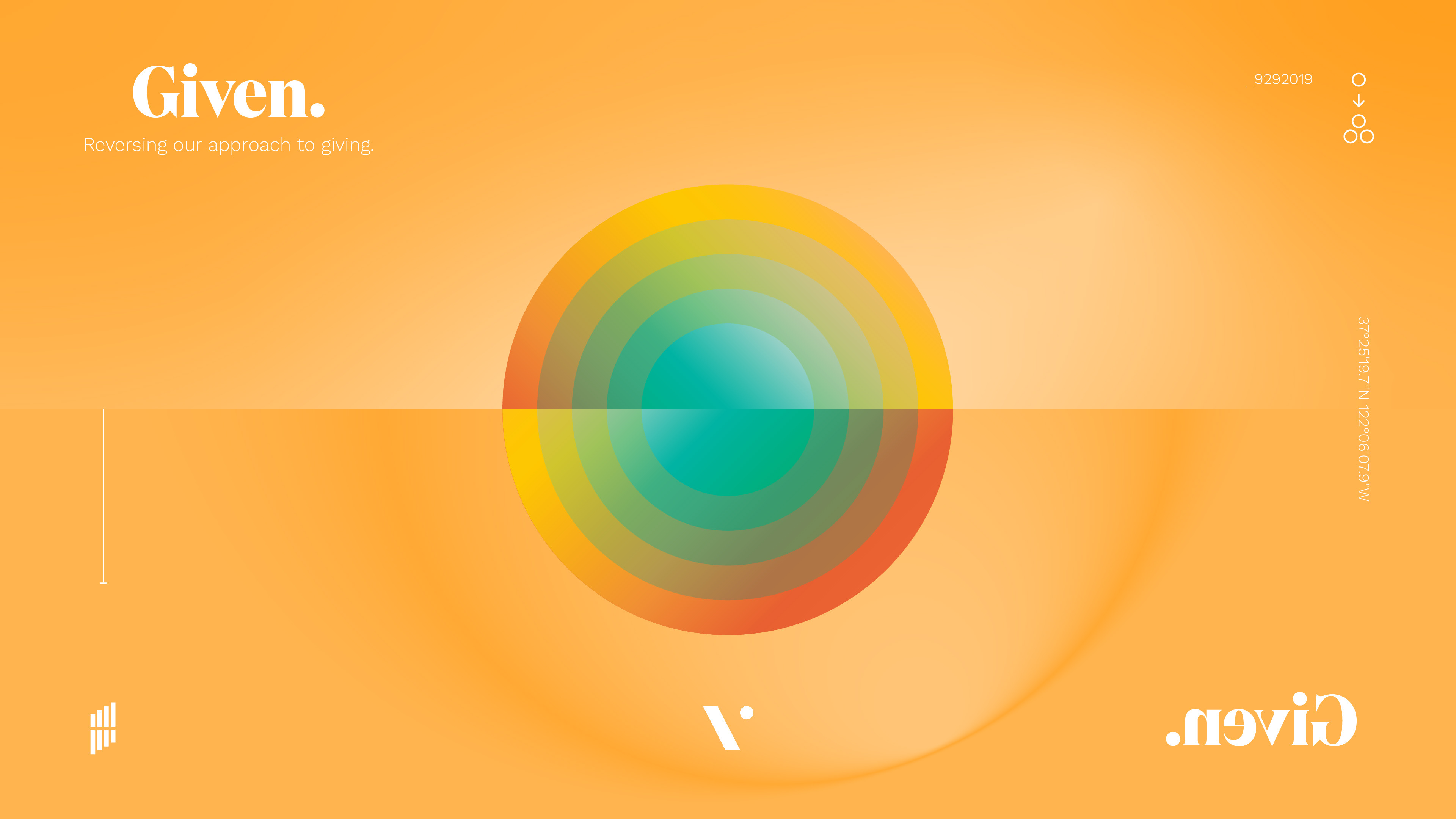
The coin, a ripple effect, the reverse text, contrasting gradients
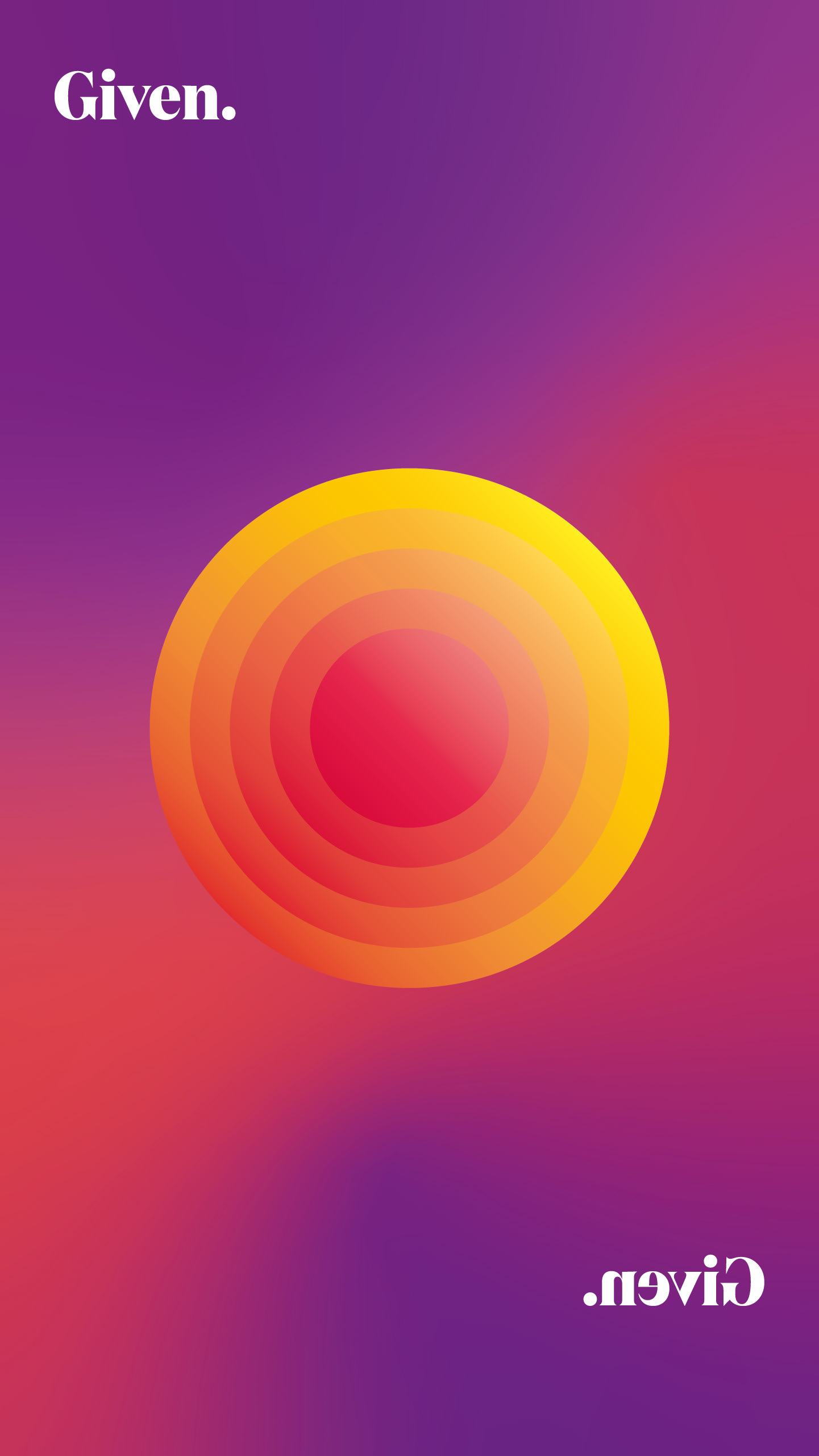
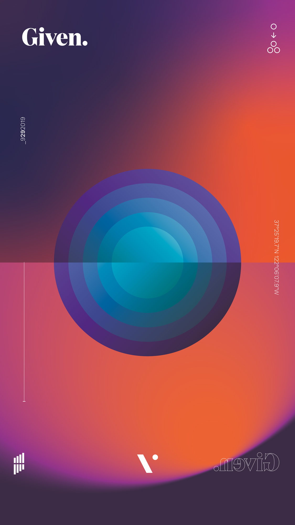
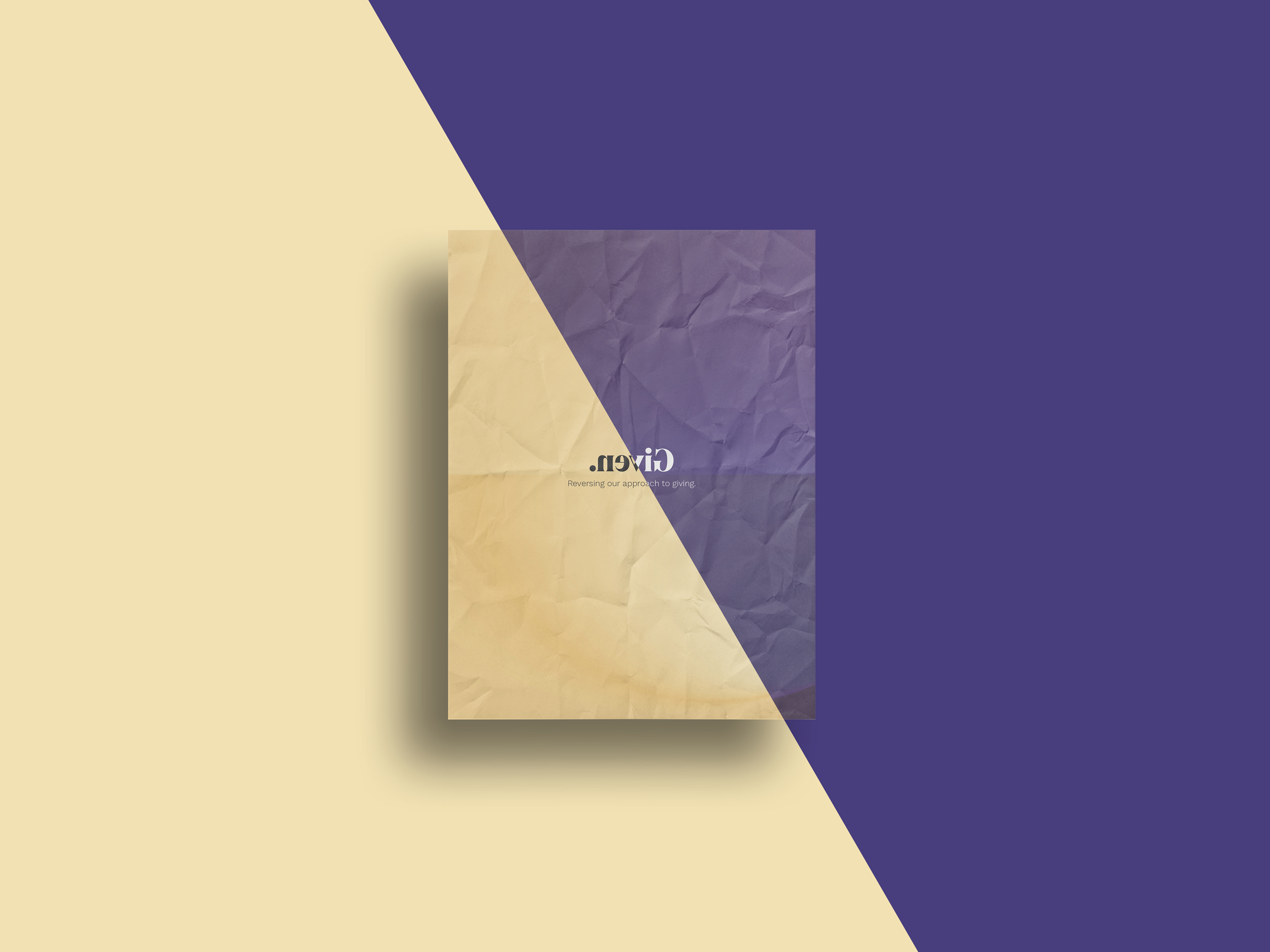
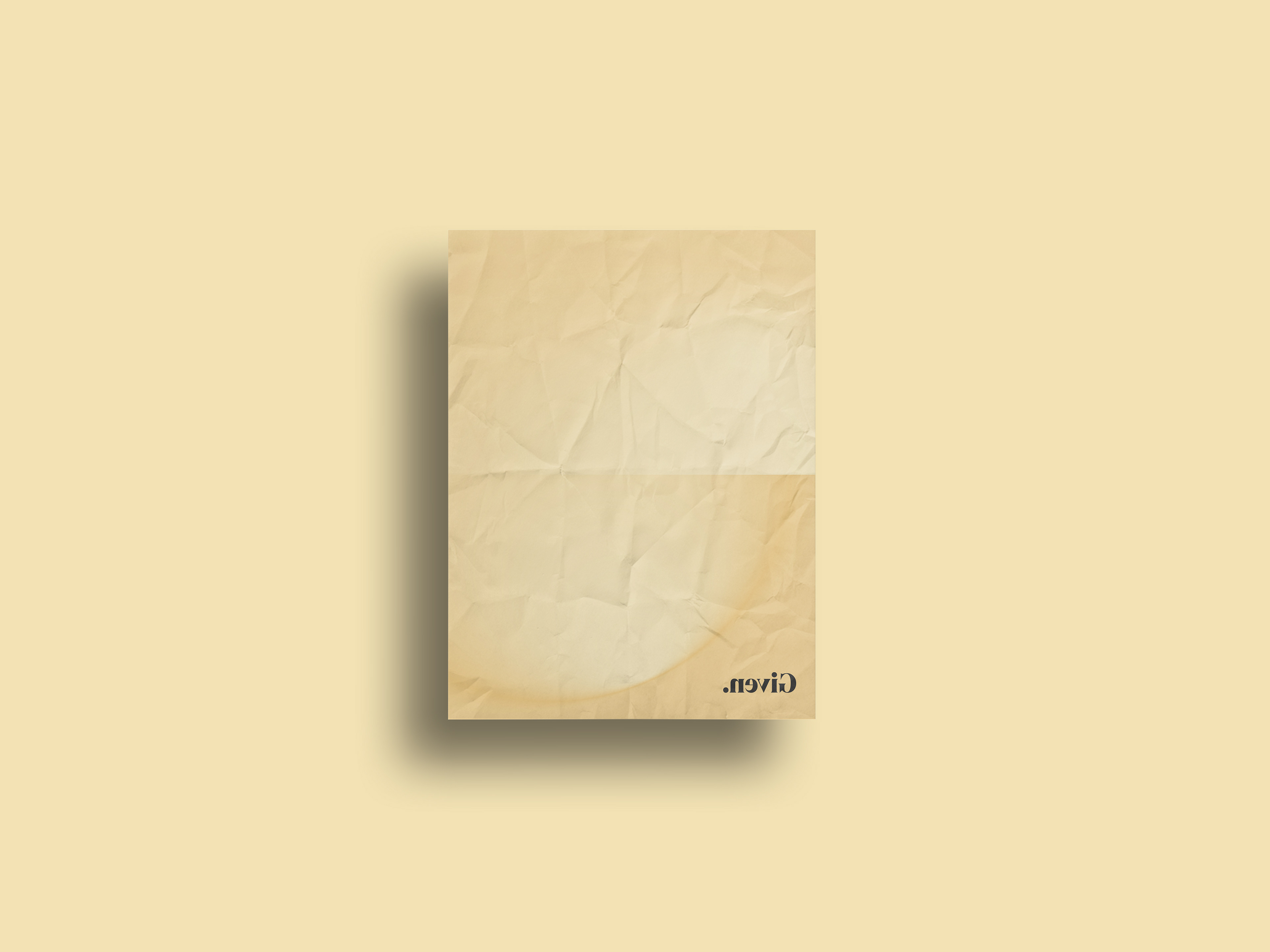
Final Design
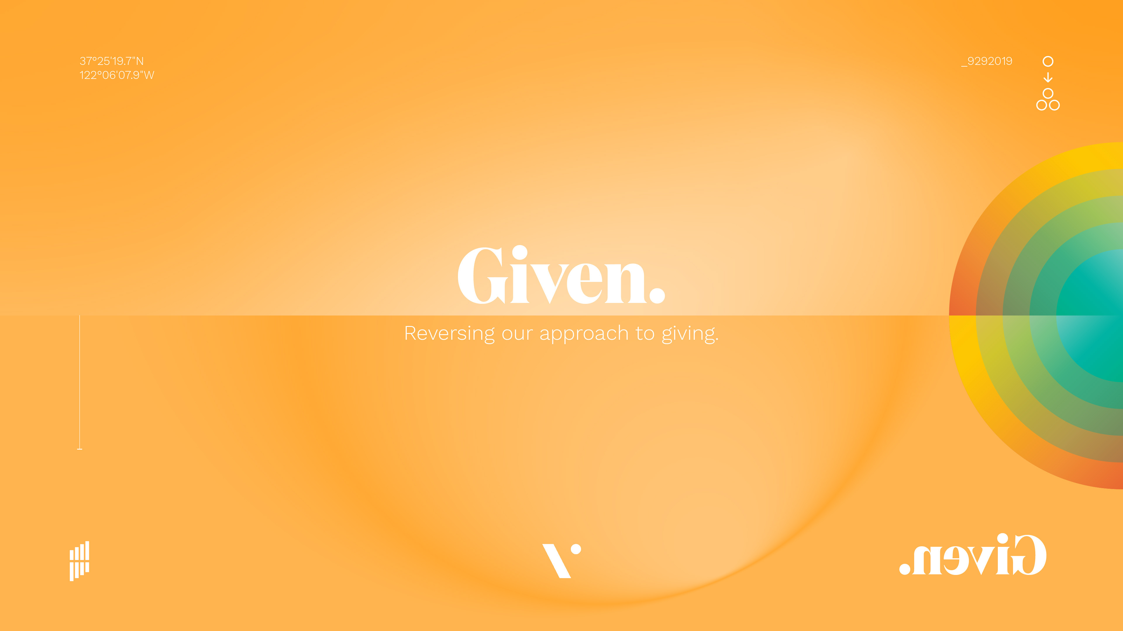
Even though the core elements were already there, the early concepts had too much going on so a simplification was due: I got rid of the unnecessary symbols and colors and kept only the reverse typography for the title, which would serve the purpose of representing the "given-give back" key theme, and a subtle tone-over-tone circle gradient for the "ripple effect" in the background.
Once I was happy with the layout I produced a light and a dark version to fit any use case.