Strategic Positioning & Brand Mission
Helisia enters the highly saturated skincare market by actively rejecting standard 'anti-aging' industry narratives. Rather than positioning products as tools to mask age, the brand strategy focuses on regeneration and age-enhancement. The core offering merges scientific innovation with sustainable, natural ingredients.
The resulting brand identity reflects a global, inclusive community that prioritizes both dermal efficacy and environmental responsibility.
Verbal Identity
To differentiate Helisia from clinical, austere competitors, the brand’s verbal identity is strictly defined by empathy and approachability. The communication strategy avoids dense scientific jargon, mandating a fresh, positive, and inclusive language structure designed to cultivate direct, trust-based relationships with a diverse consumer base.
Main Logo
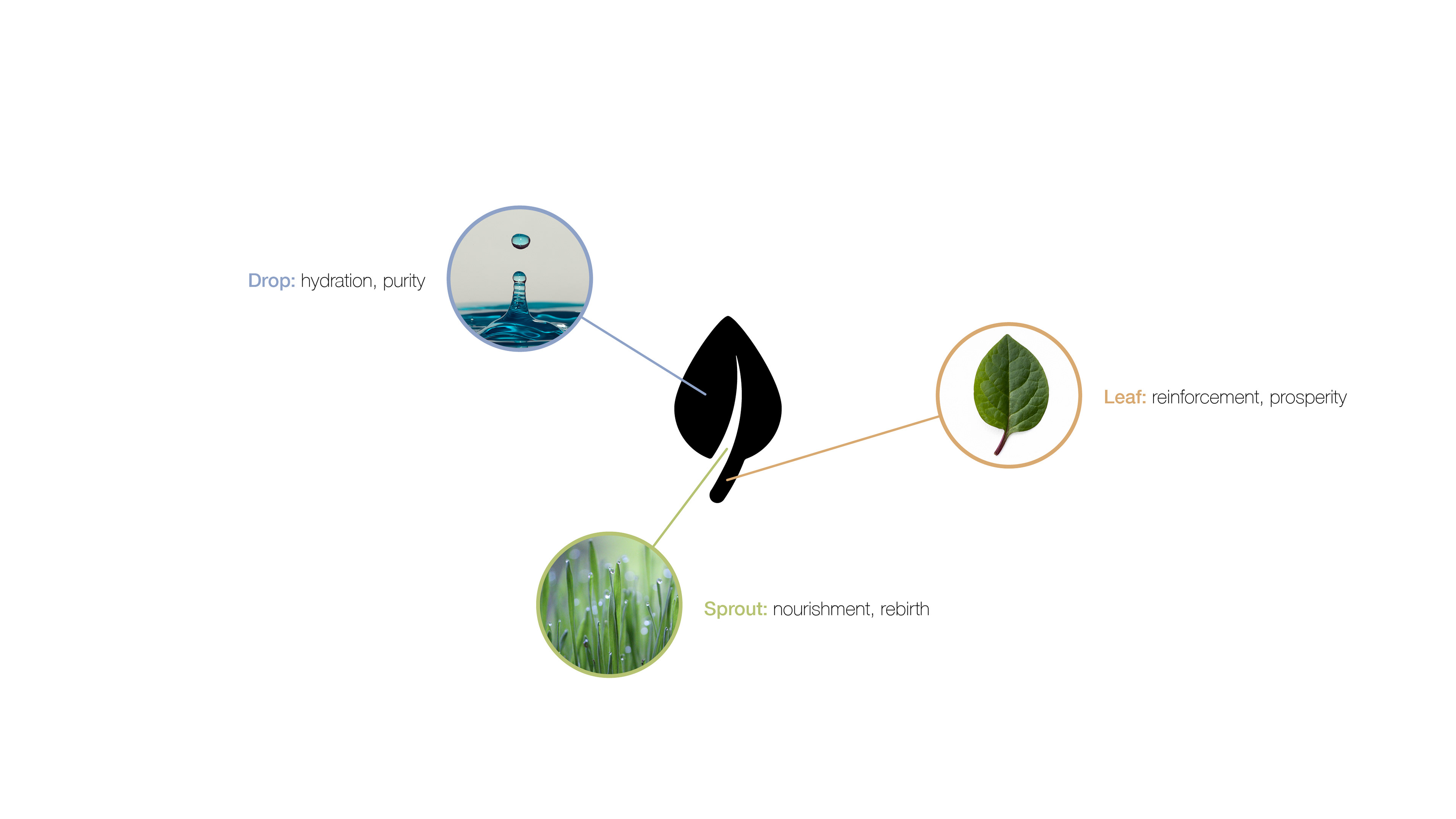
Visual System & Mark Deconstruction
The primary logomark is not merely decorative; it is a functional composite of three distinct brand pillars translated into a single vector execution.
The Drop: Represents foundational hydration and formula purity.
The Sprout: Represents biological nourishment and cellular rebirth.
The Leaf: Represents structural reinforcement and organic prosperity.
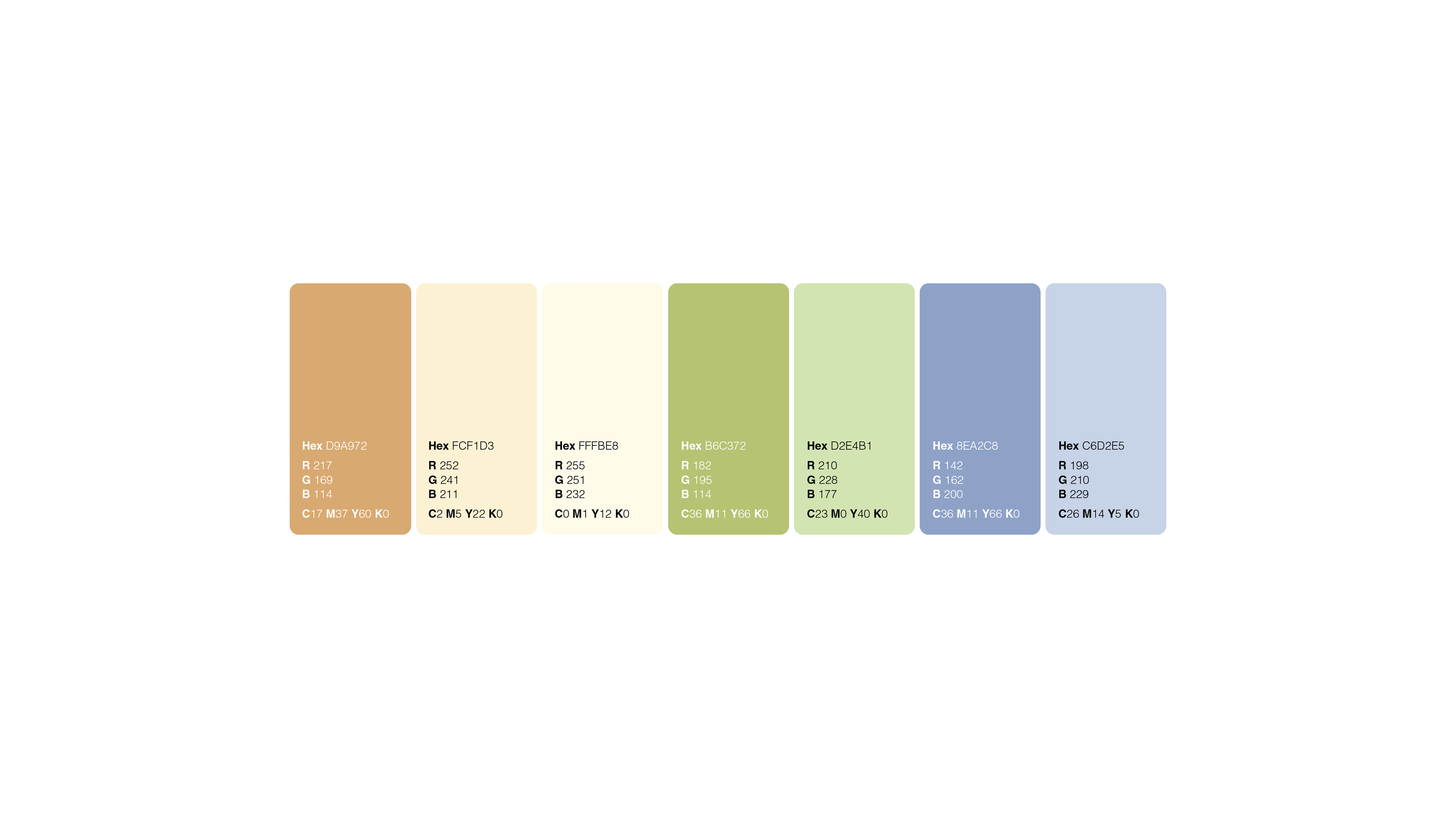
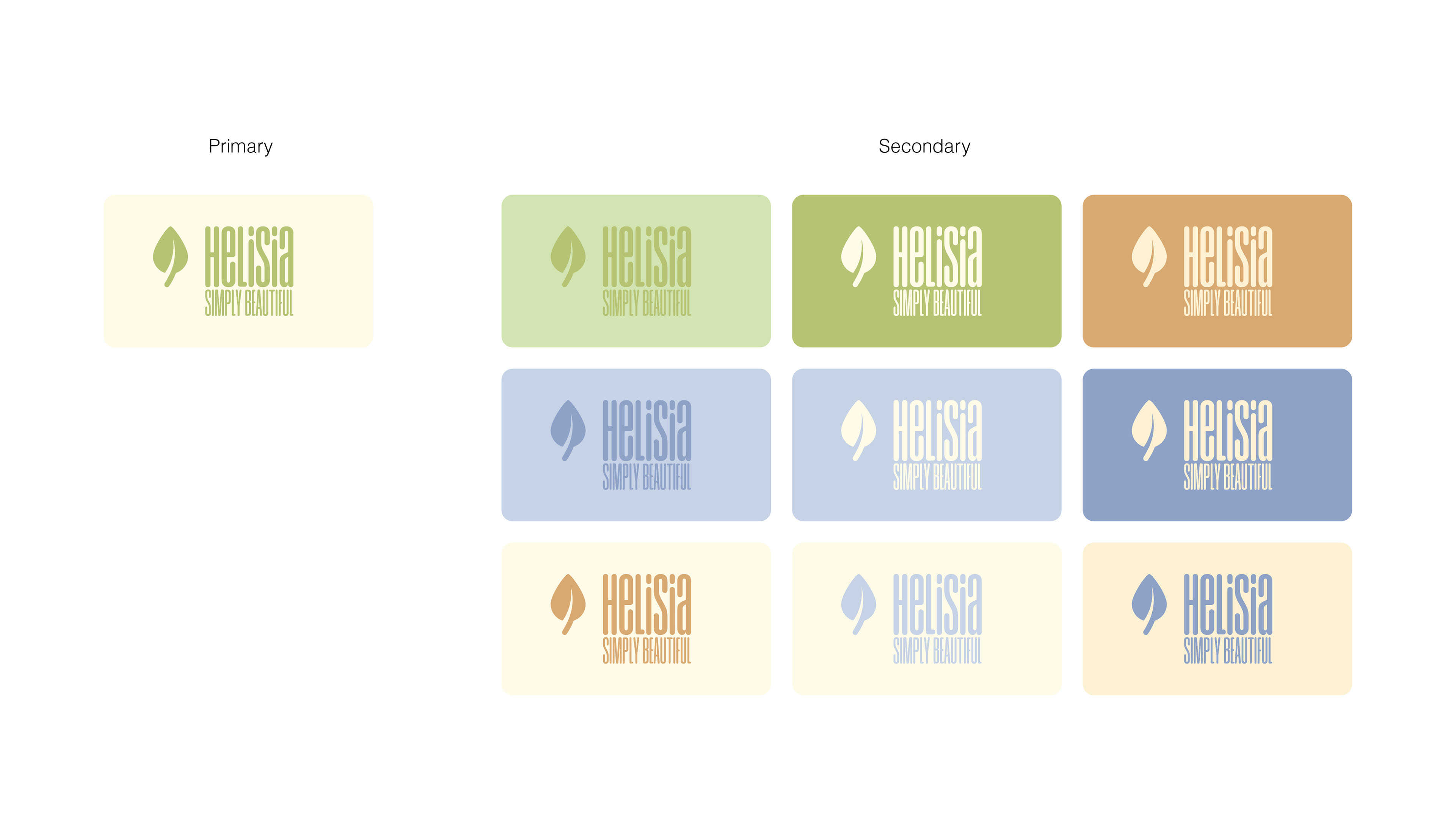


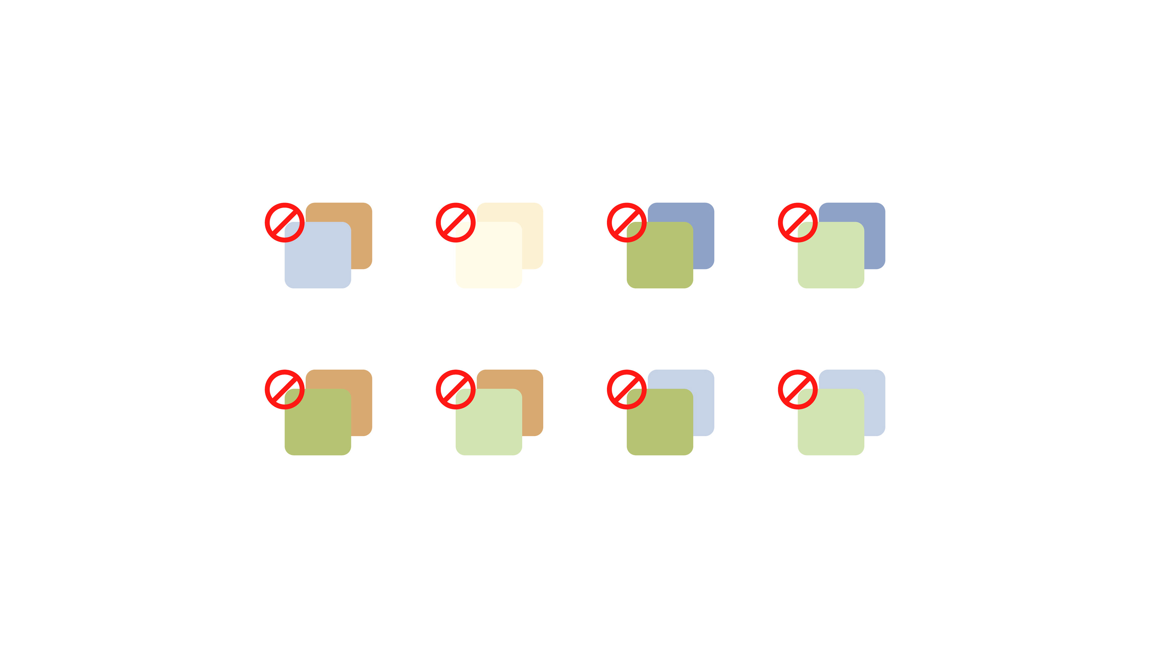
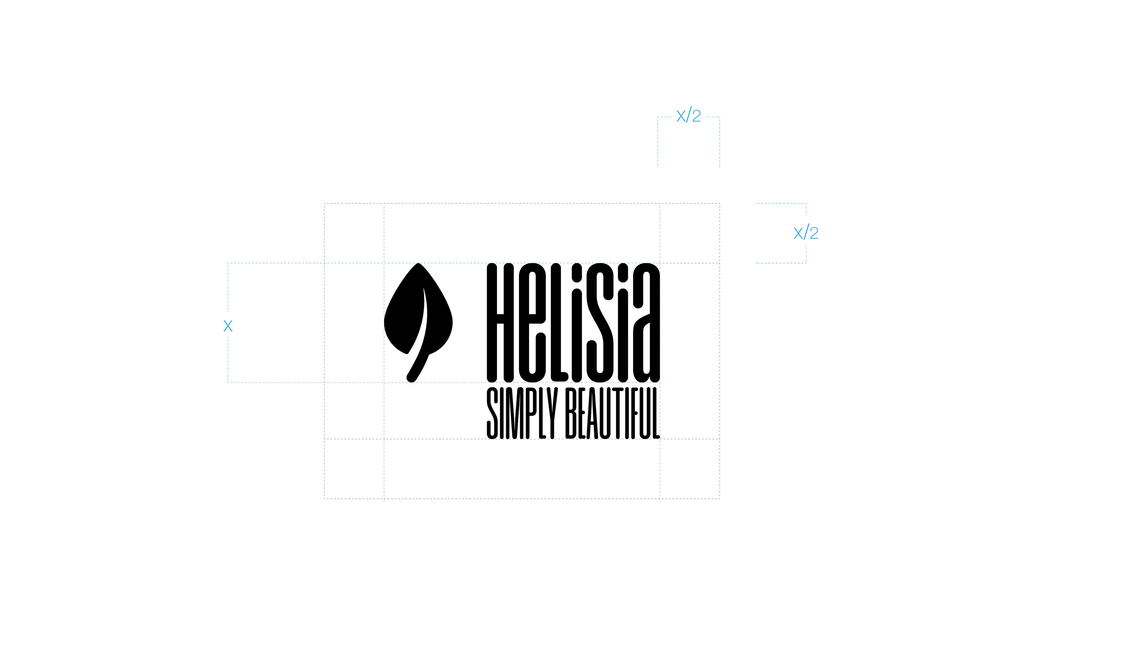
Design Rules & Constraints
A rigid set of rules governs the brand's visual output to ensure scalability and consistency across all touchpoints.
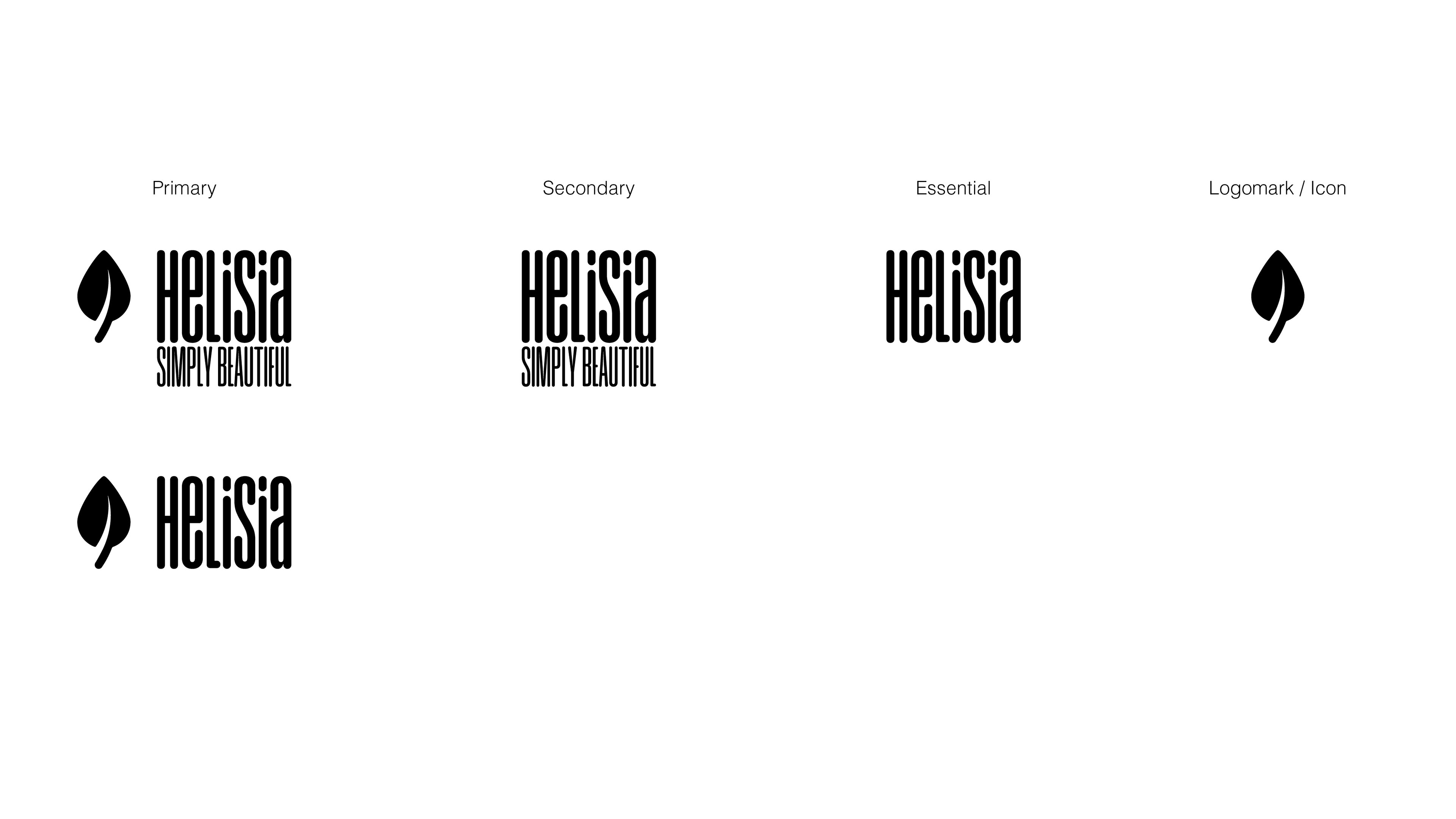
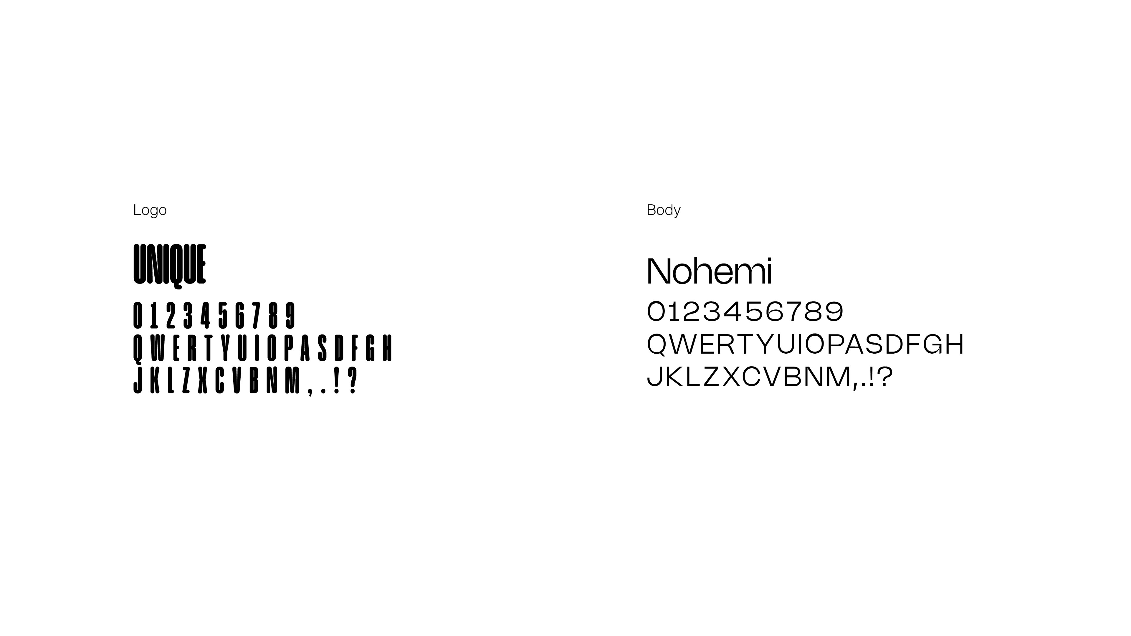
Typography: The customized display font 'UNIQUE' drives brand recognition in the logo, while the highly legible sans-serif 'Nohemi' handles all functional and informational copy.
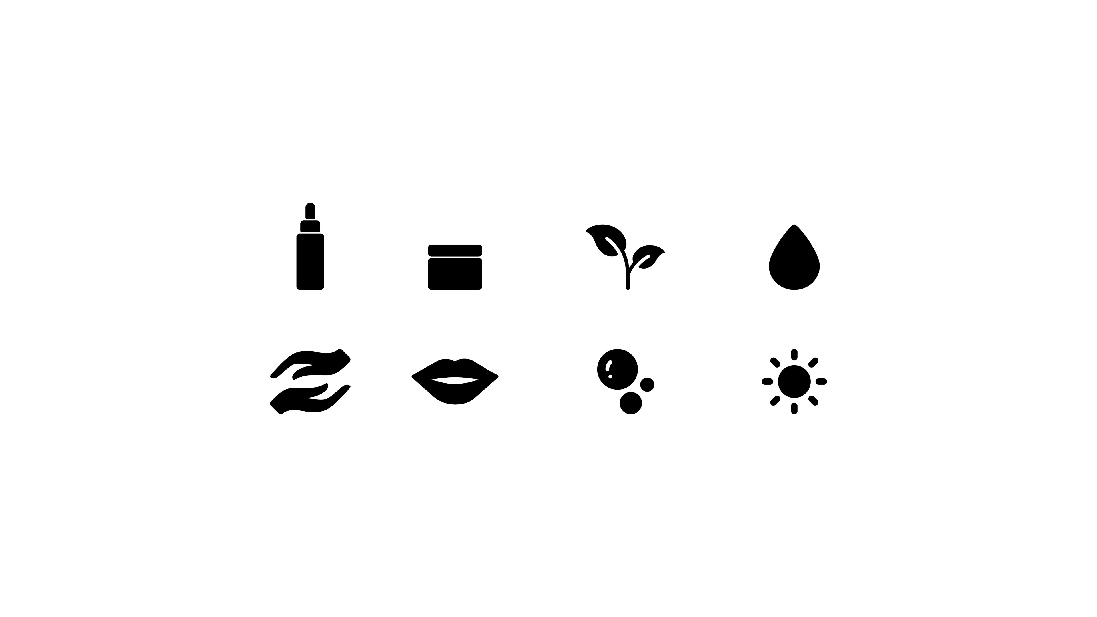
Iconography: The iconographic system is strictly confined to solid geometric fills with rounded terminals. To maintain visual approachability, sharp angles, line-art, and shadowed outlines are explicitly prohibited."
Visual references for photoshoots and content creation

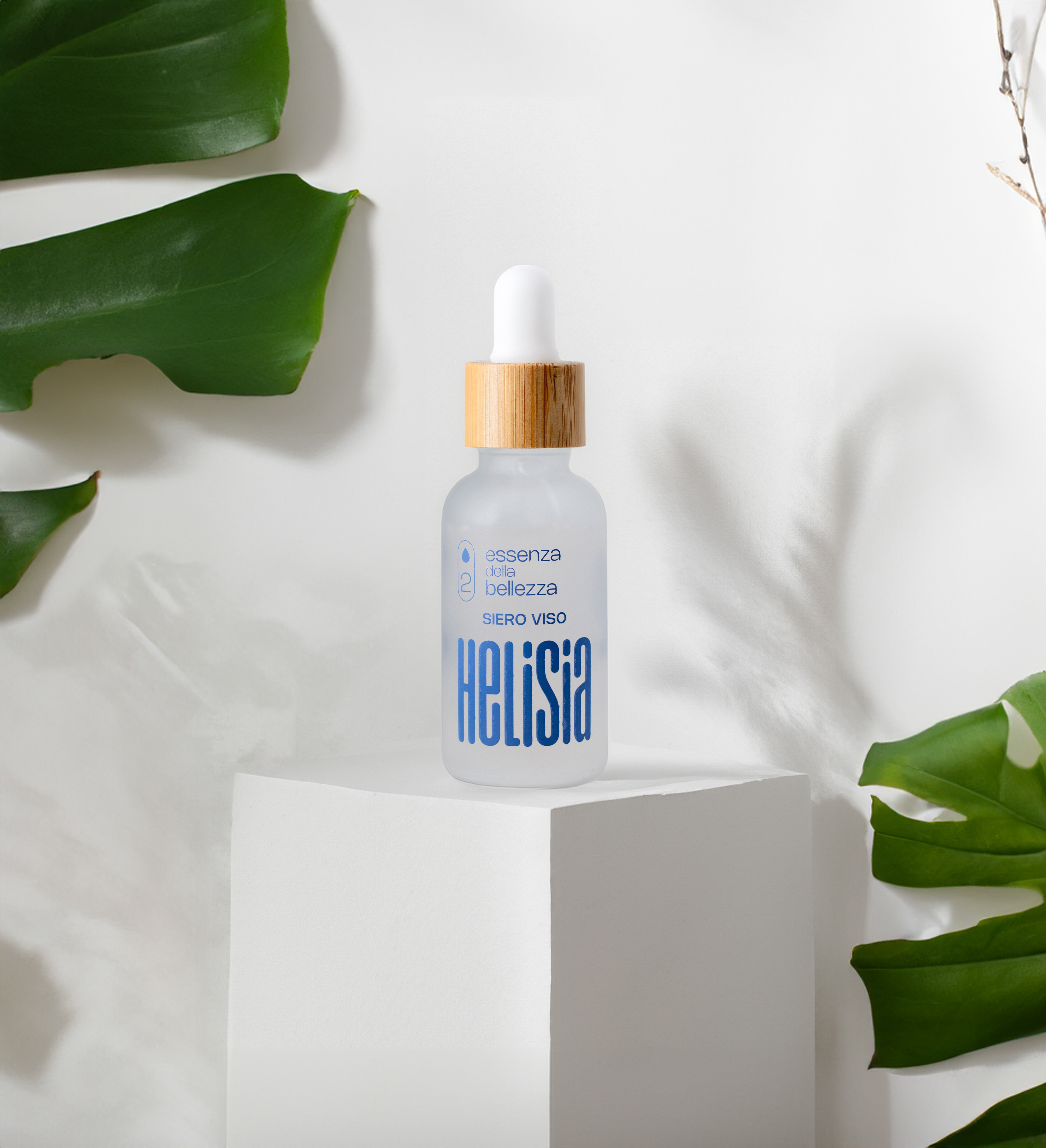
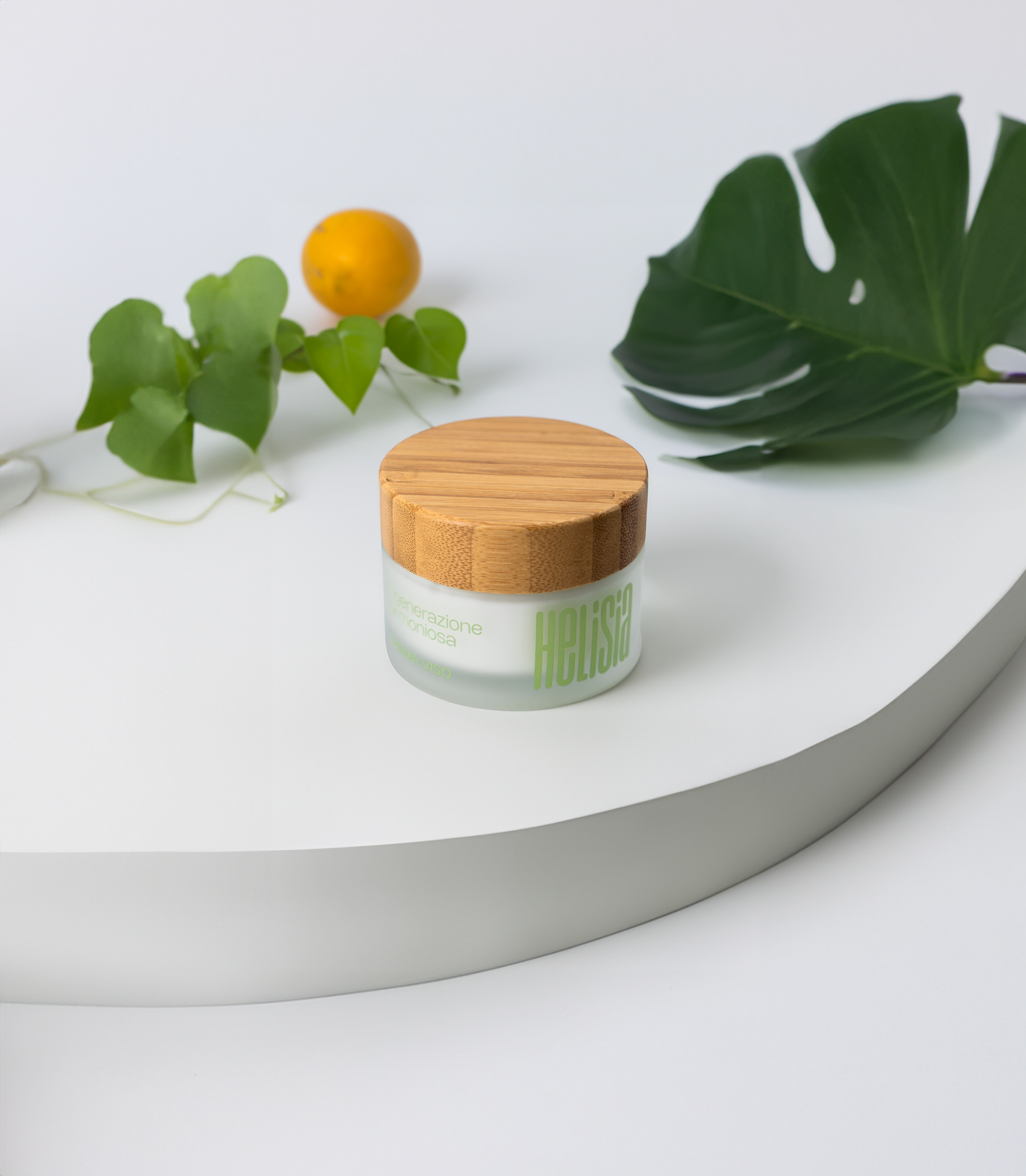
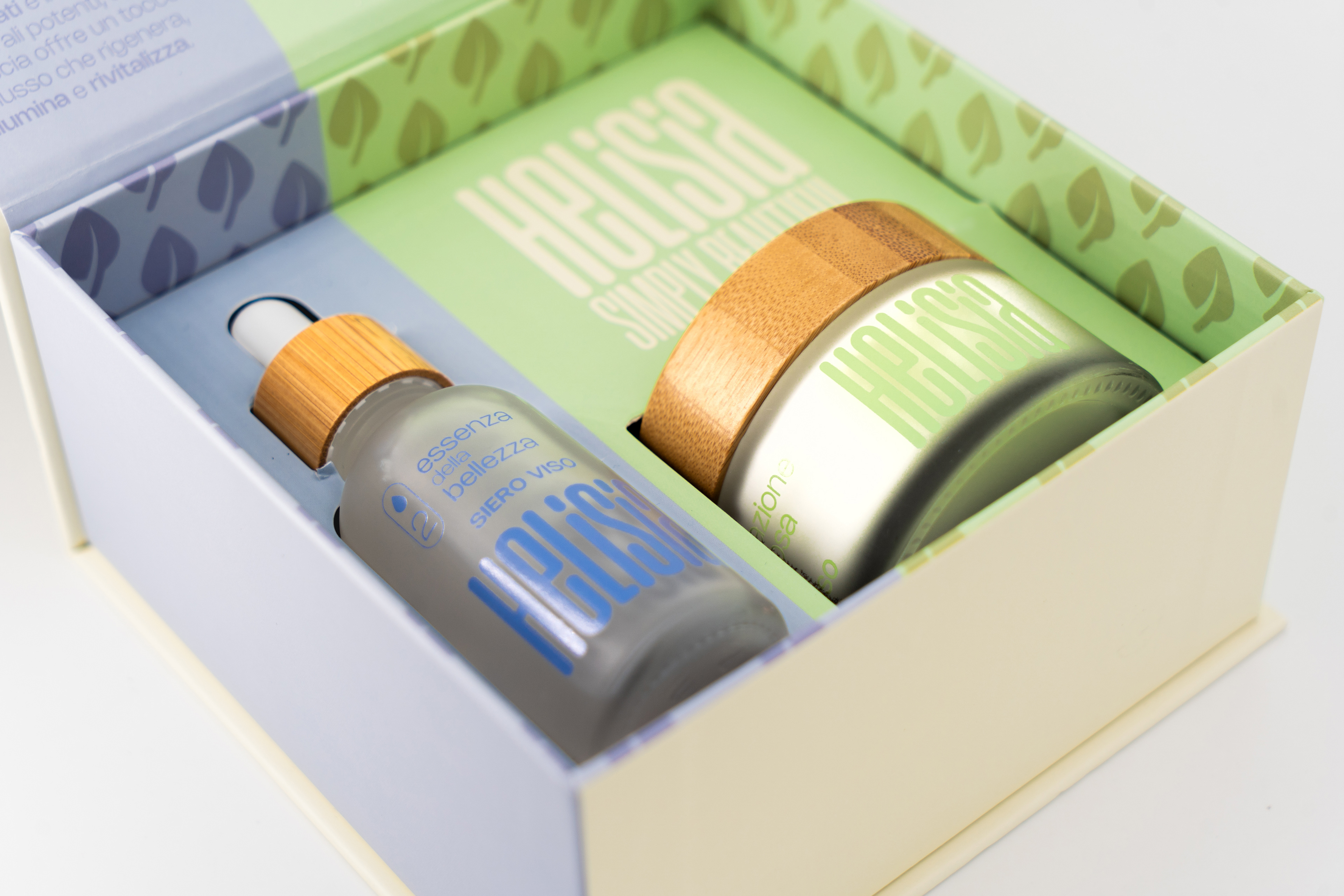
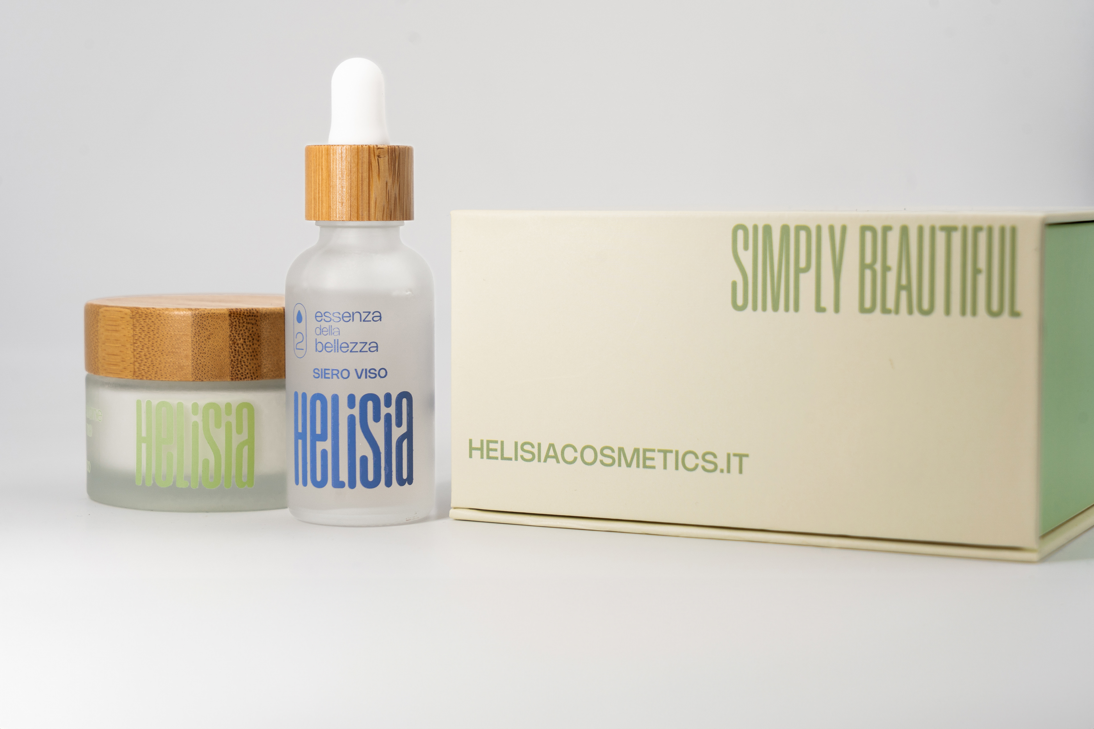
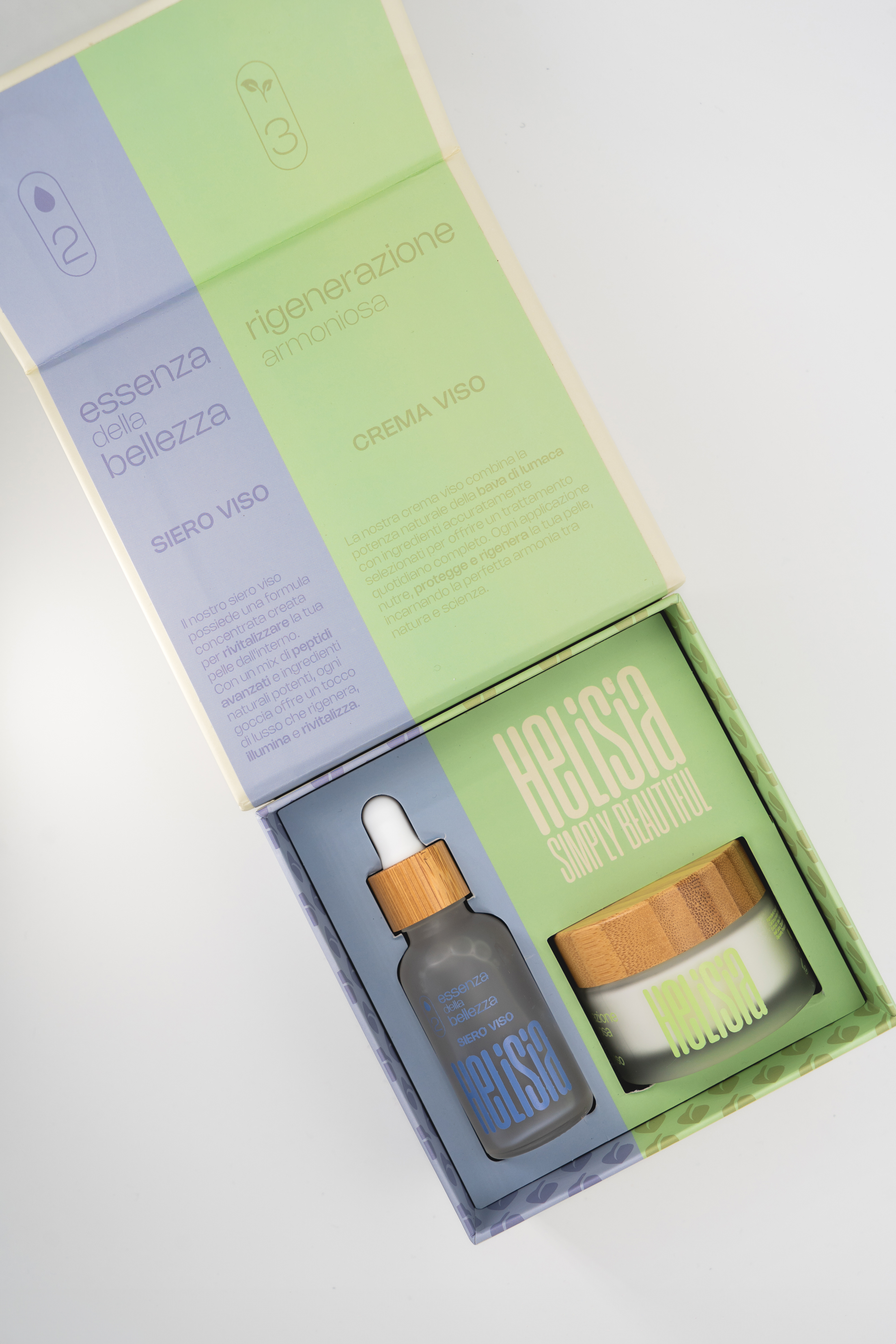
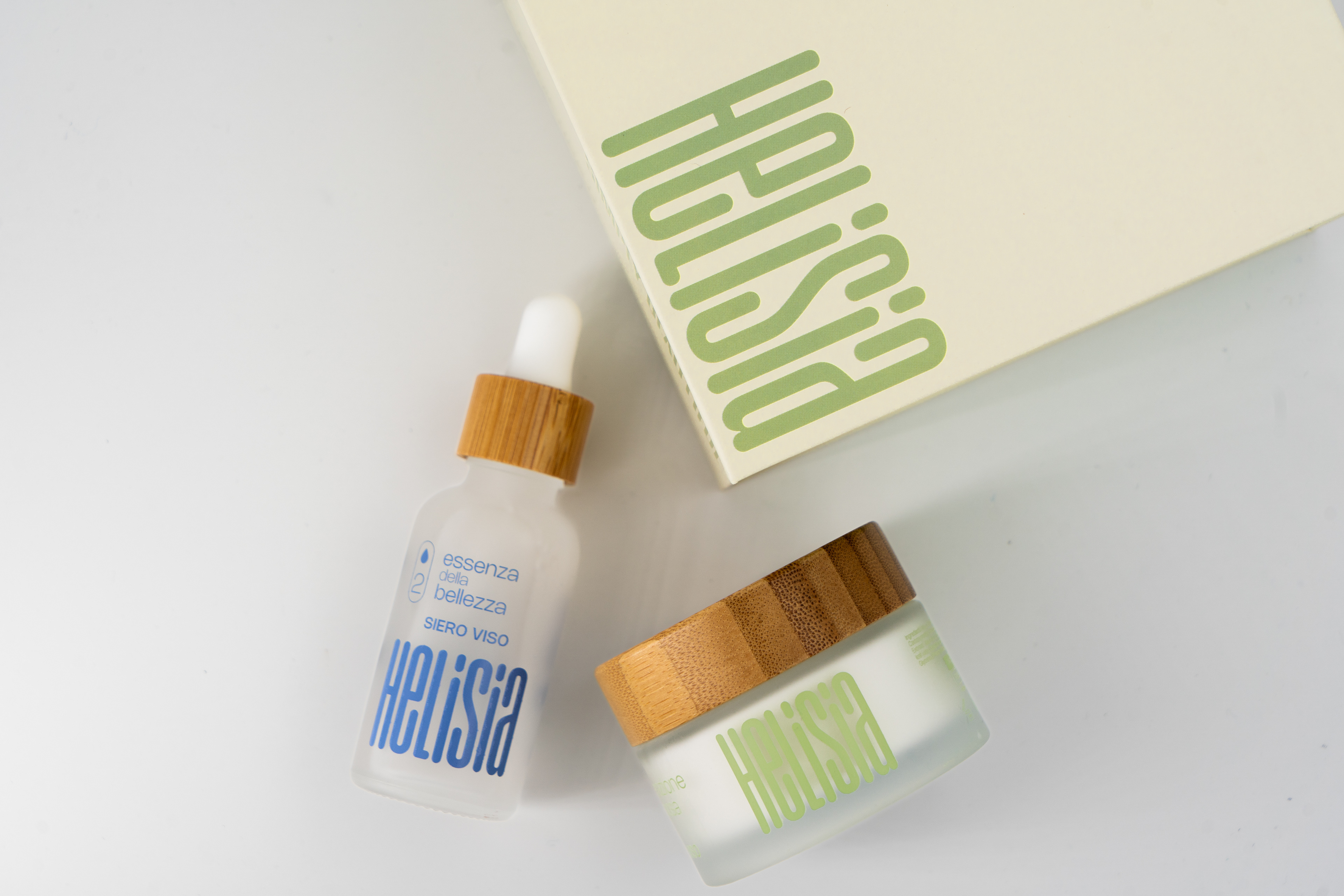
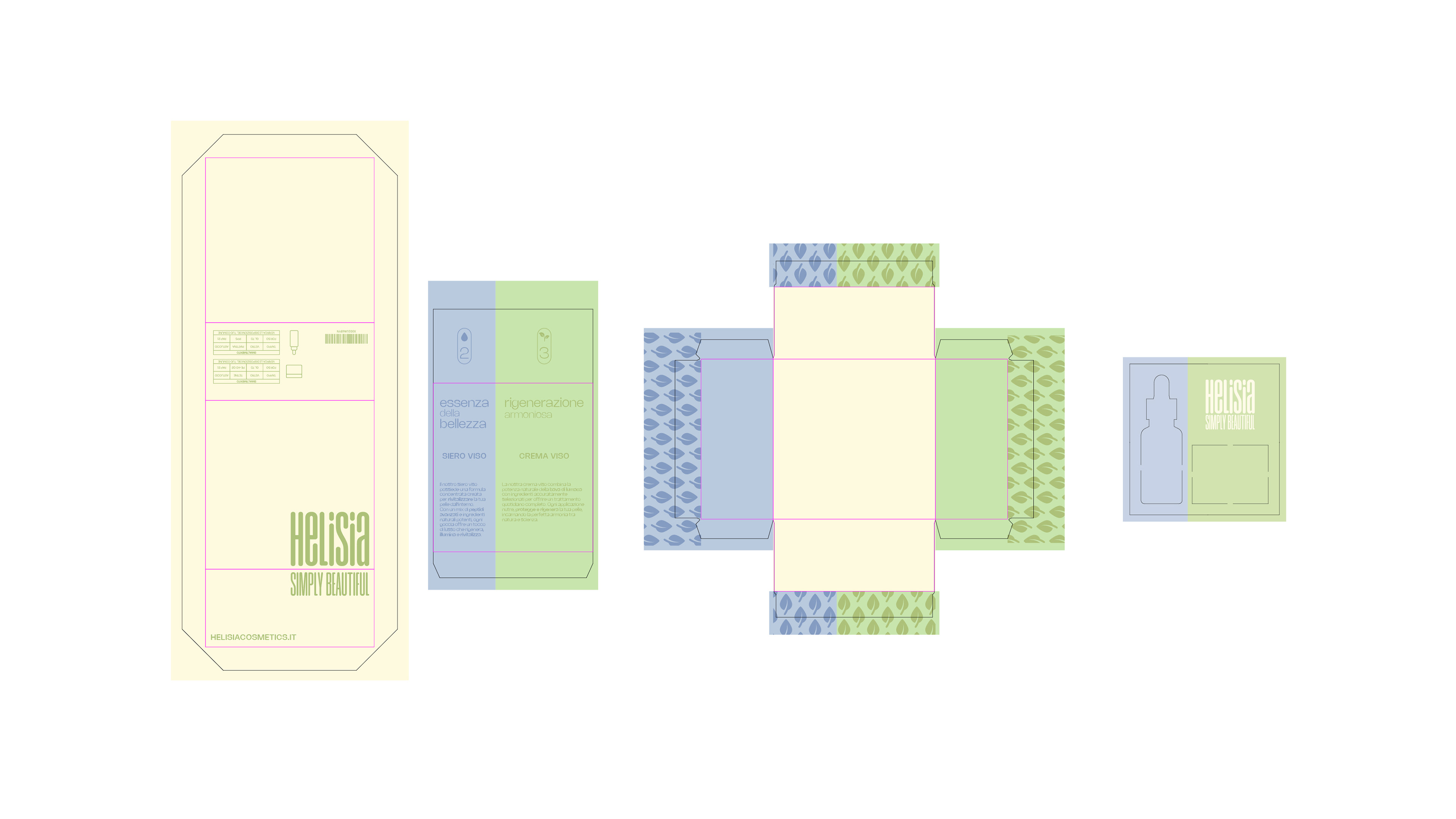
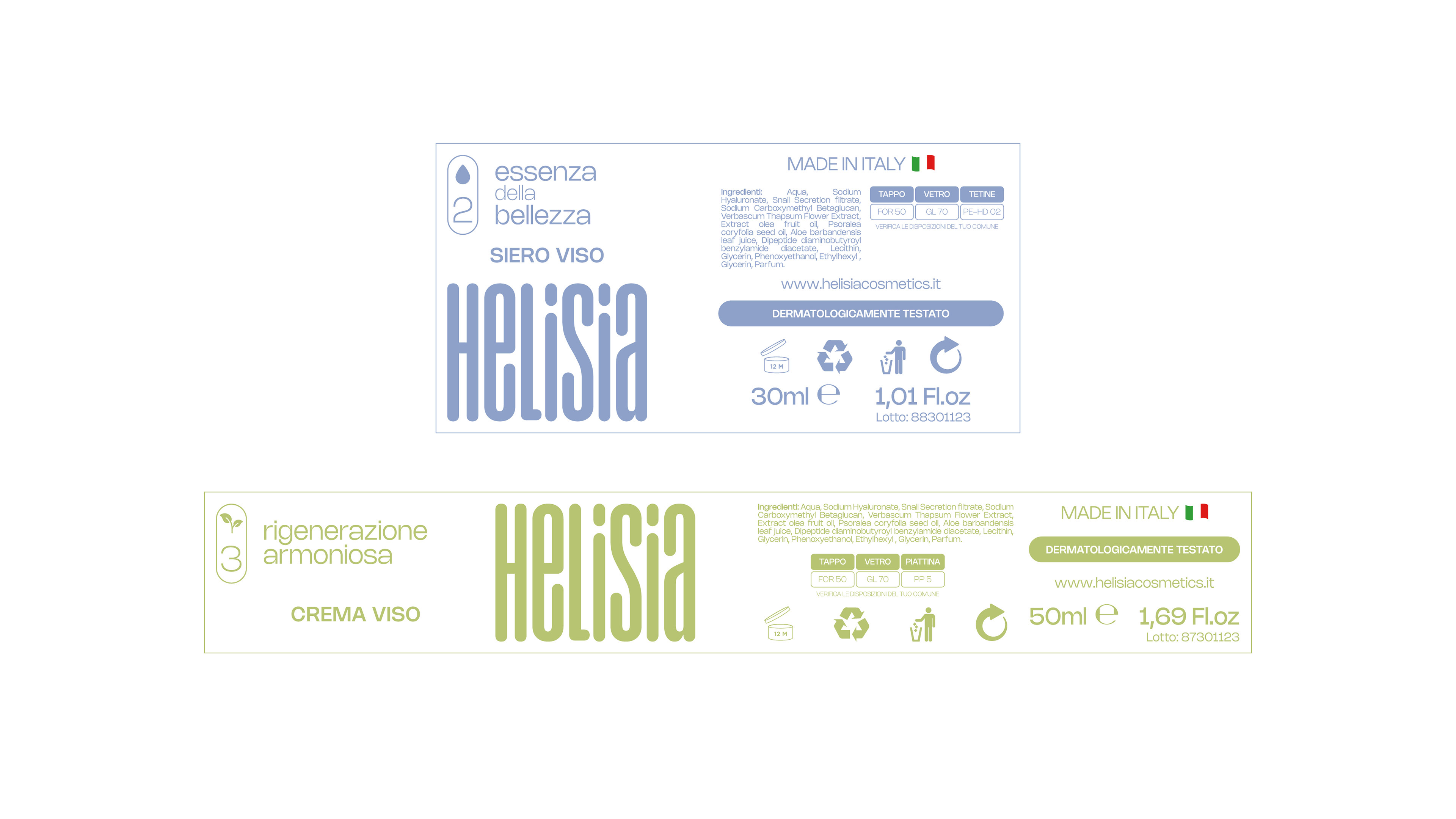
Packaging Functionality & User Experience
Packaging design was approached as a user experience challenge rather than a purely aesthetic exercise.
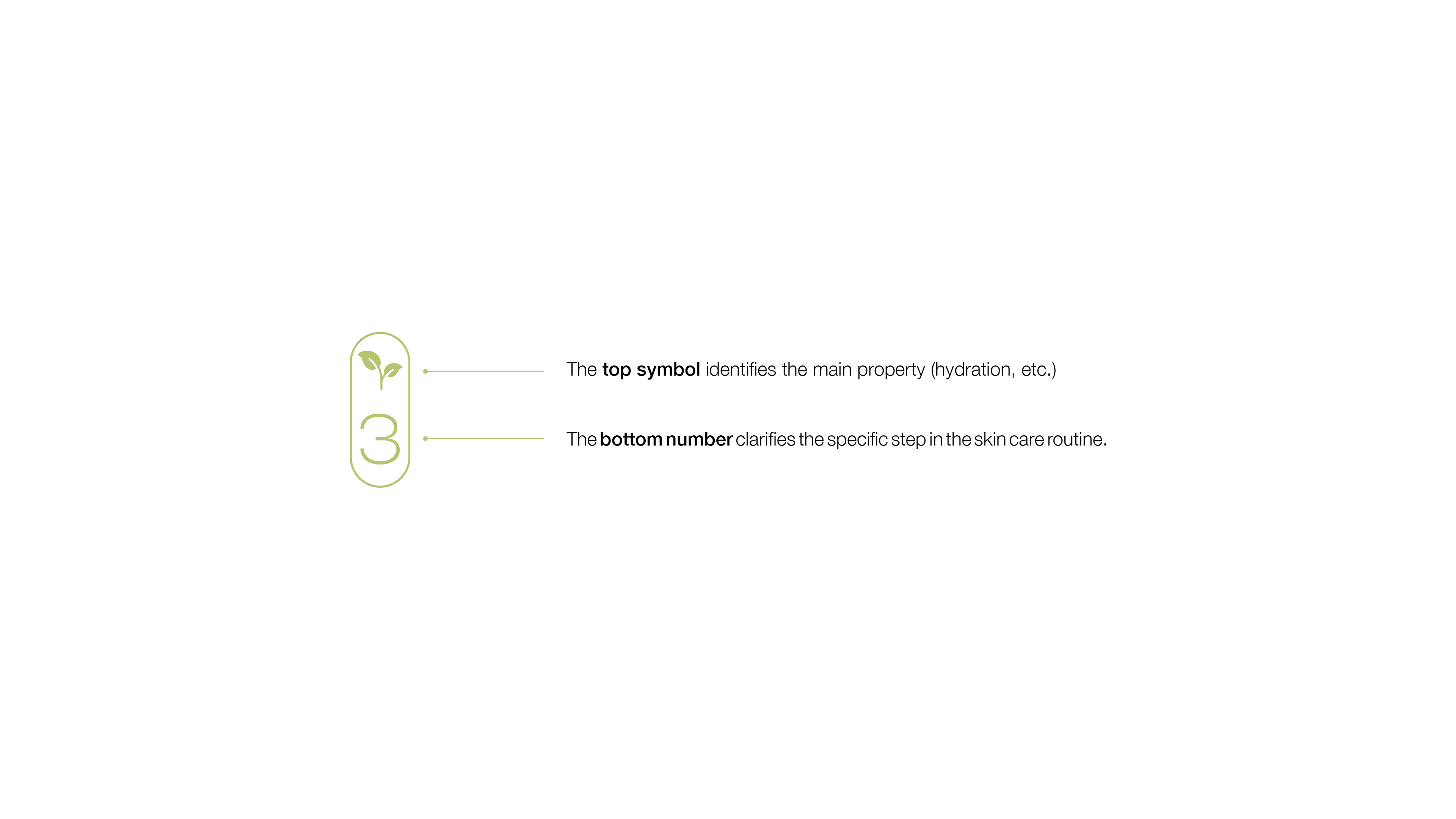
To reduce friction in the consumer's daily skincare regimen, a functional labeling framework—the 'Pill' system—was developed.
This graphic container acts as a quick-reference guide: the top icon communicates the product’s primary functional property (e.g., cleansing, hydration), while the bottom integer dictates its exact chronological step in the user's routine.
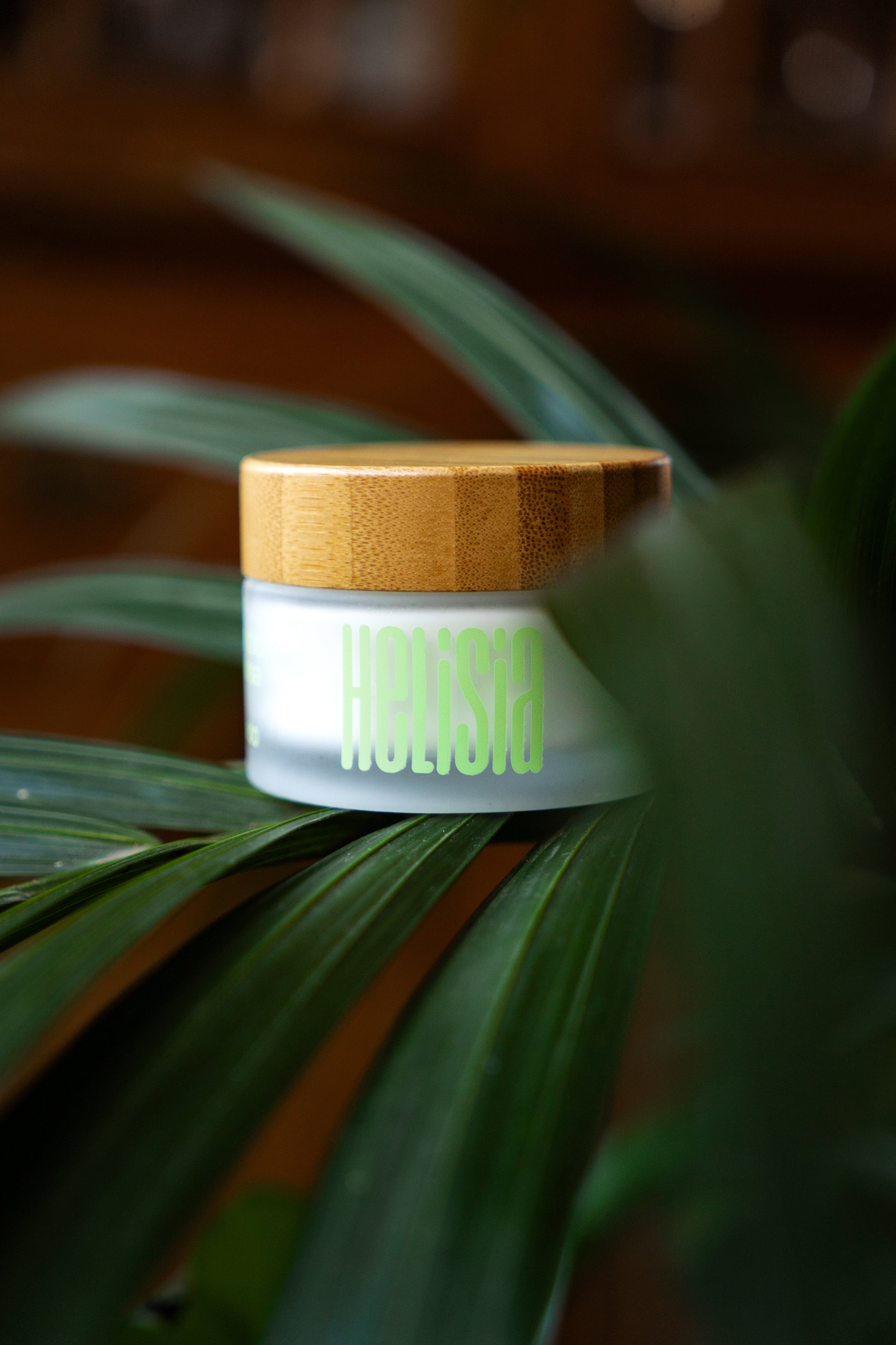
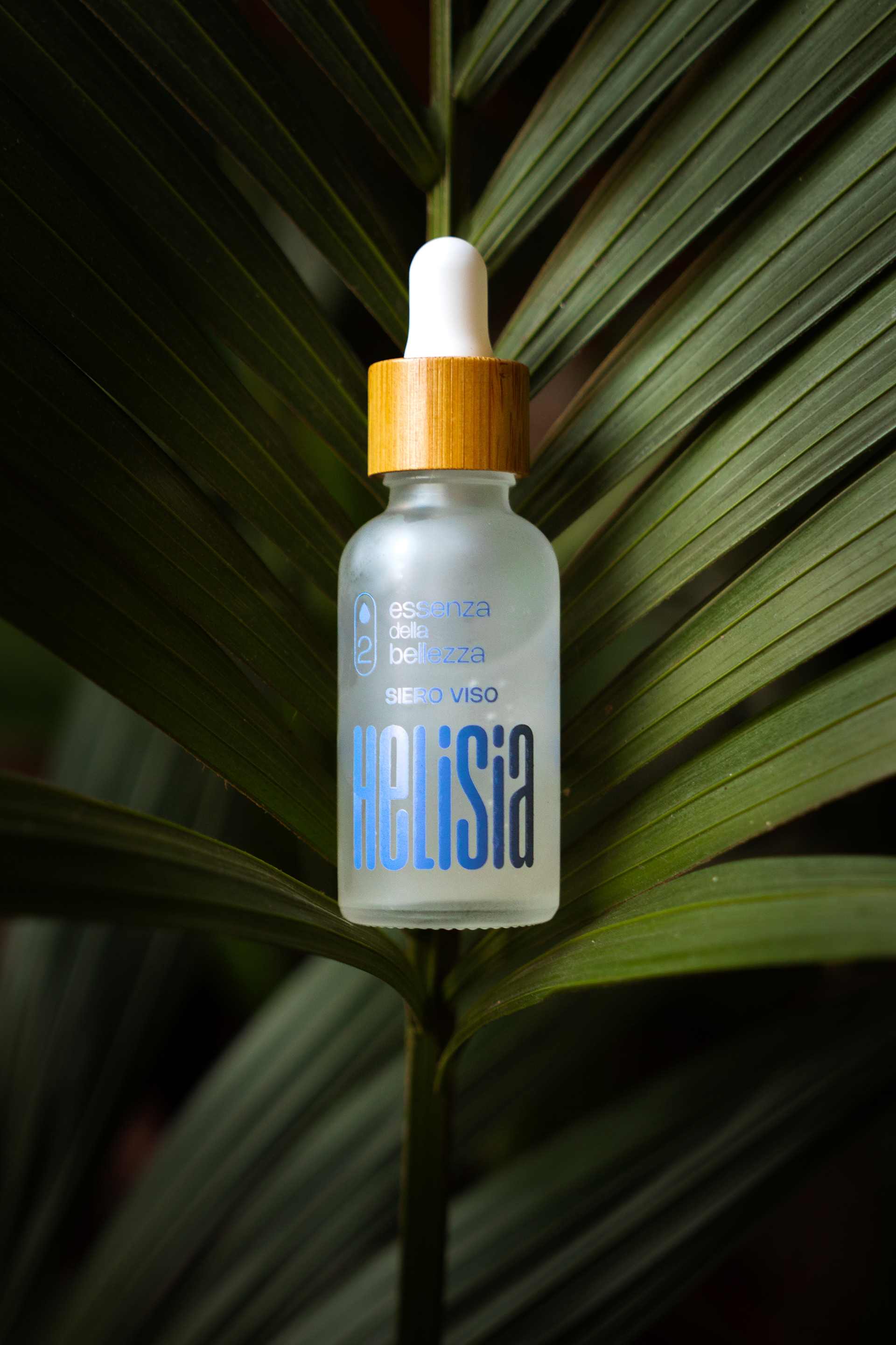
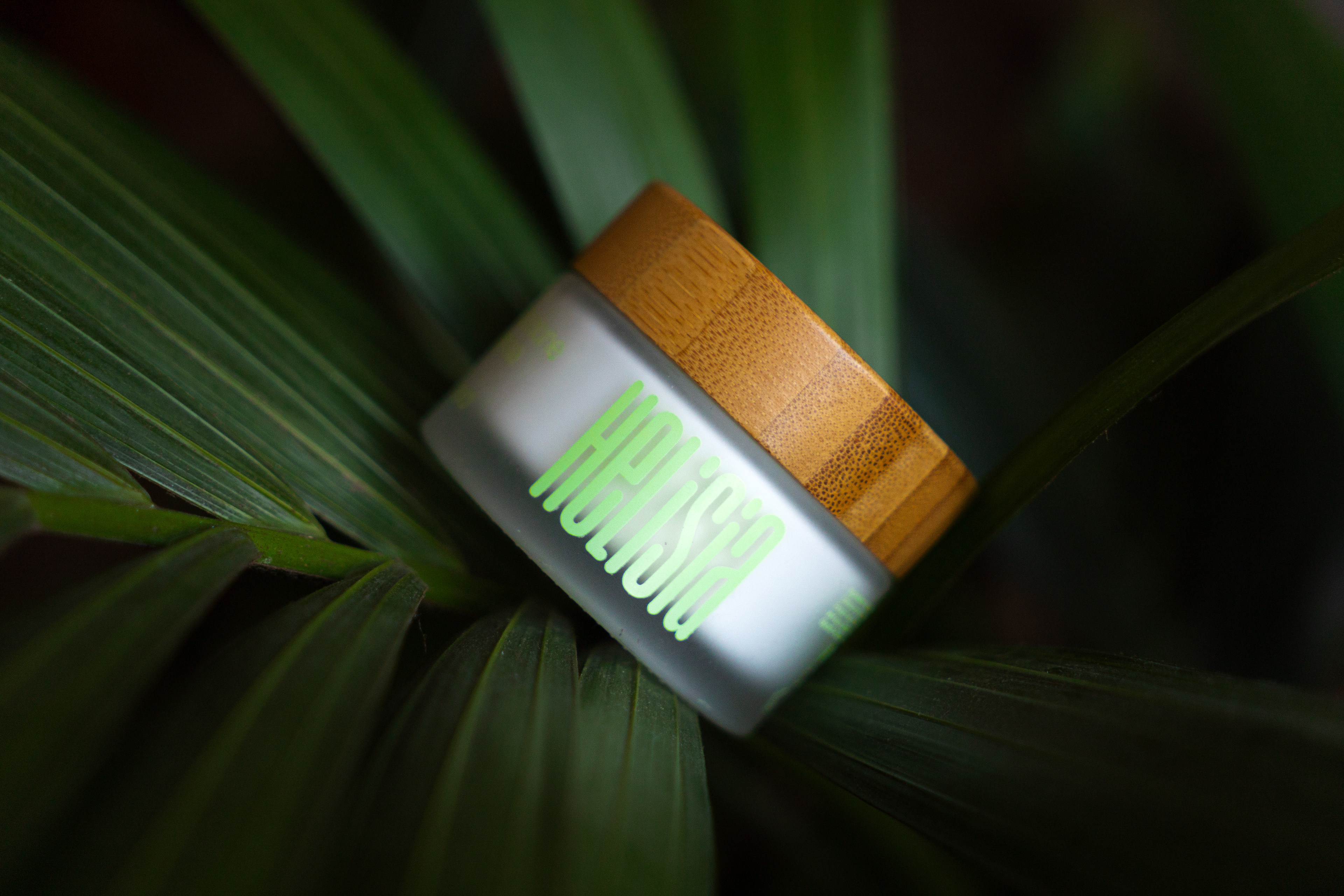
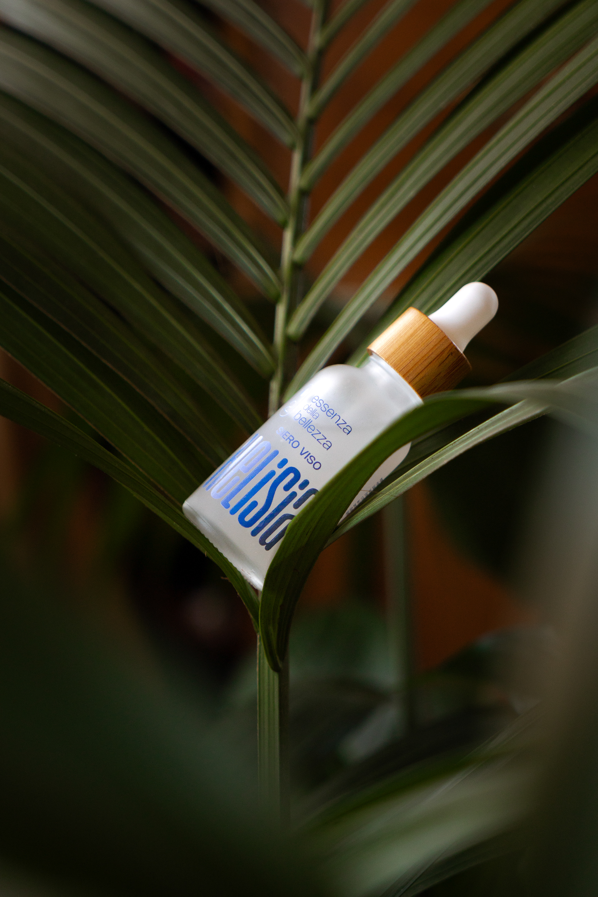
Finalised product Media